San Diego Humane Society
San Diego Humane Society and SPCA, is a non-profit organization in San Diego, California with three campuses in San Diego County.
UX/UI Redesign and Development Exercise
View Prototype
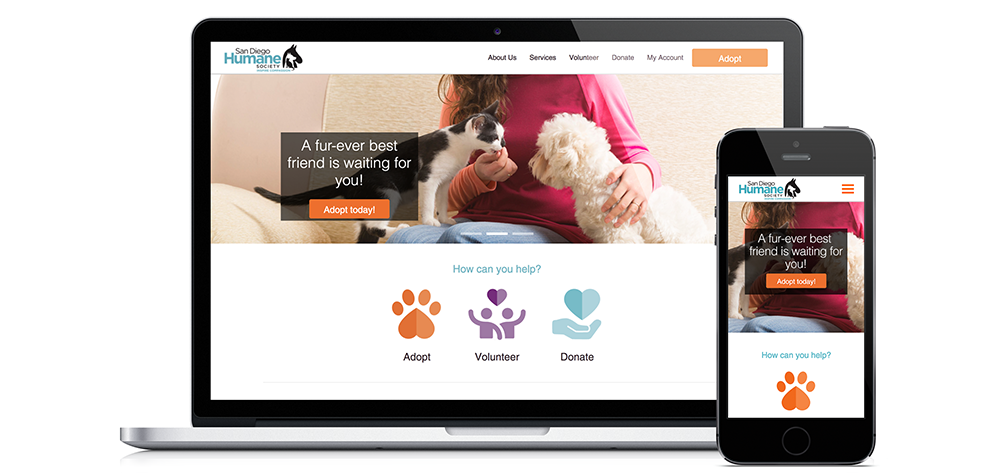
Responsive landing page, desktop and mobile
Exercise
The goal of the redesign of the San Diego Humane Society is to facilitate and encourage user engagement in terms of adopting, donating, and volunteering. After conducting an expert review of the page, it was found that the current SD Humane Society experience could be improved with more clear calls to action, the addition of more animal imagery, and an improved search user expeience.
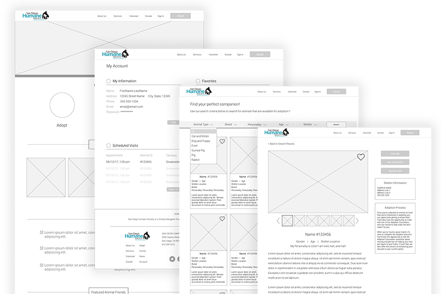
Wireframes, home page (far left), account page (mid-left), search results page (mid-right), animal profile page (far right)
Process
This project began with conducting an expert review of the existing San Diego Humane Society website, looking at usability heuristics and perceived main goals. High level goals for the site were created, and wireframes and prototypes were tested with users. Finally, the project was developed using a responsive bootstrap framework.
-
Expert Review
Reviewed the site with design heuristics in mind. The main area of opportunity on the page was individual user involvement. With the amount of content, it was difficult to find the main action elements: adopt, volunteer, and donate.
-
Wireframes
Created wireframes to sketch out the main pages for redesign: home, account, search results, search item, and scheduling. Defined the experience for filtering animals and for scheduling an appointment to see an animal.
-
Visual Design
Incoporated visuals and branding elements (logos and color) from SD Humane Society's current design as well as designed new elements (photography and iconogrpahy) .
-
Prototype
Created an interactive prototype for user testing and development guidelines.
View prototype -
User Feedback & Iteration
Conducted three user feedback sessions with task analysis on the prototype, mainly focused on searching for an animal to adopt using the newly designed filtering options and scheduling a visit with the aniaml. Based on this feedback, iterated on all pages of the redesign in terms of visuals, experience, and interactions.
View usability report -
Development
Coded redesign using Sass and Bootstrap frameworks. Pages are mobile responsive with defined breakpoints.
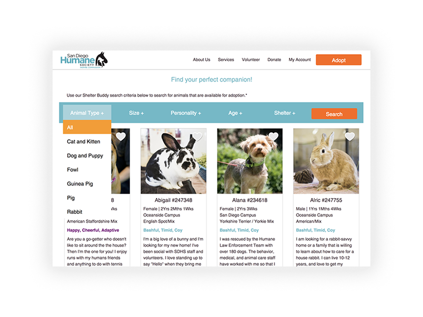
Filter/search page functionality, original design
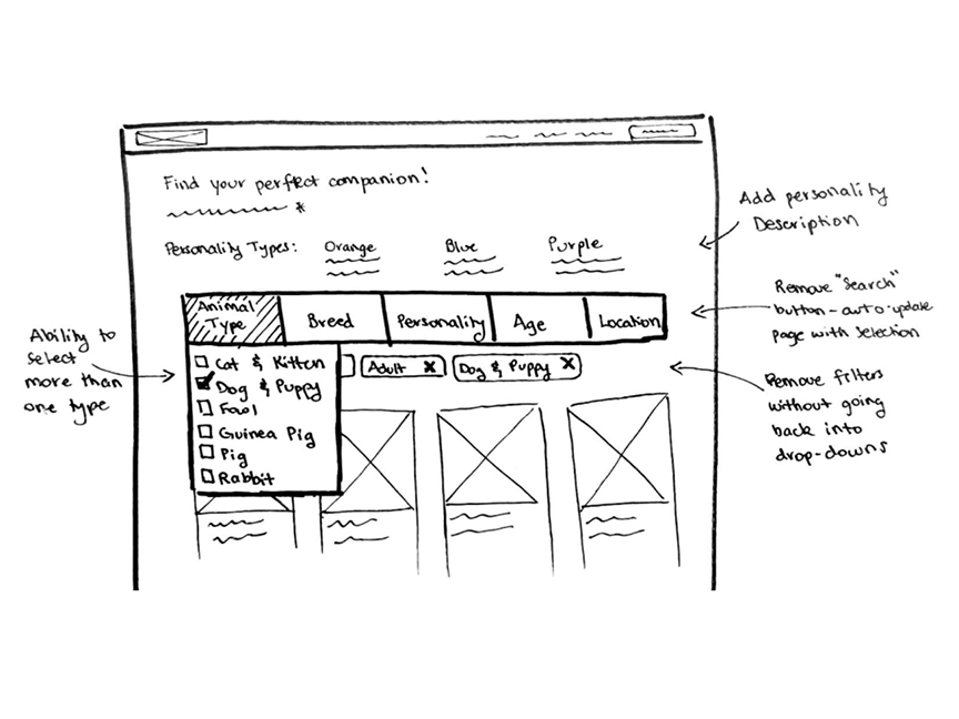
Filter/search page functionality, sketch based on user feedback
Solution
The goal of this redesign exercise was to better engage users who come through the site.
There are three main ways people can help the Humane Society: adopting an animal,
volunteering, or donating time, money, or resources. These three actions were given
prominence on the page. The action that the majority of users who land on the page are
here to do, Adopt, was highlighted in the header image as well as the navigation bar.
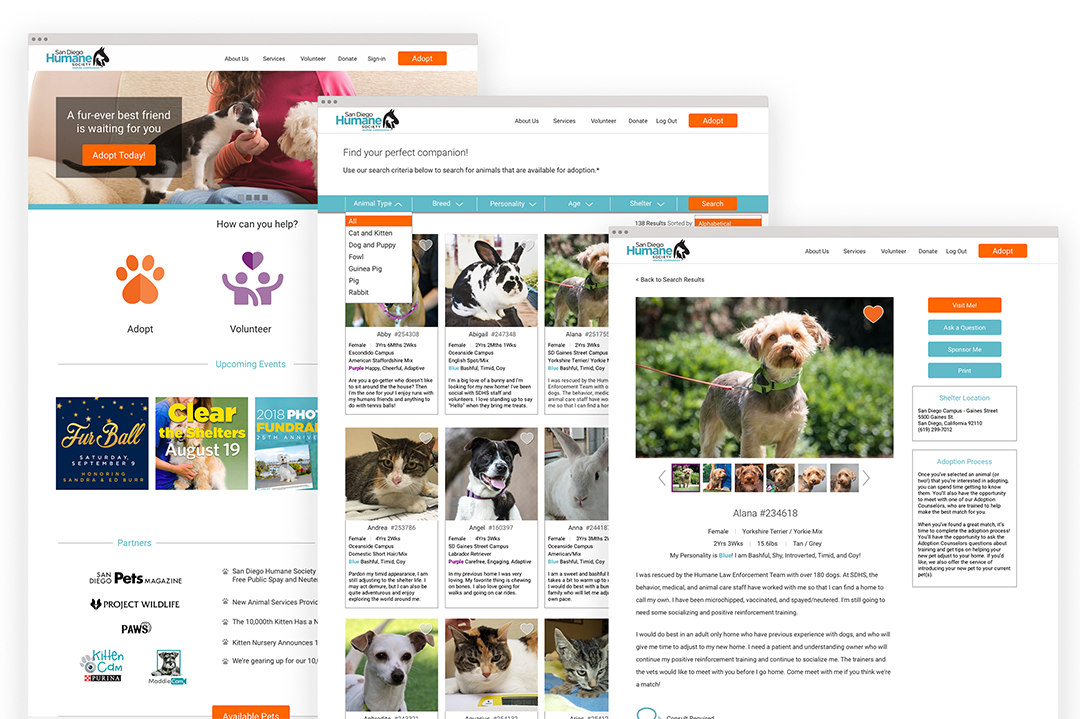
The new design features an improved filtering UI on the search page with multiple
selection options to narrow the focus by animal, personality, location, age, and breed.
The amimal profile page was redesigned to prominently feature the animal imagery and
description, and to allow easy scheduling of meetings.
View Prototype
Final designs, home page (far left), search (middle), animal profile page (far right)
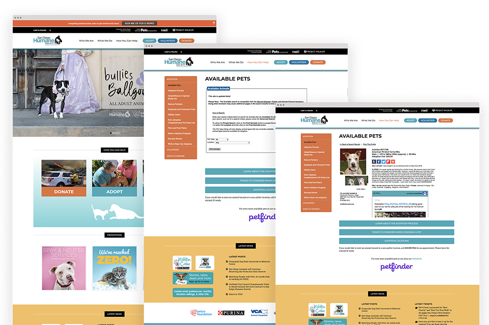
Original designs, home page (far left), search (middle), animal profile page (far right)
Takeaway
The personal goal of this redesign exercise was to acheive a deeper understanding of
HTML, CSS, and Bootstrap in responsive web design.