HP Developer Experience
A strategic internal initiative designed to foster collaboration among employees, promote the sharing of tools and technologies, and support professional growth and career development across the organization.
Goals
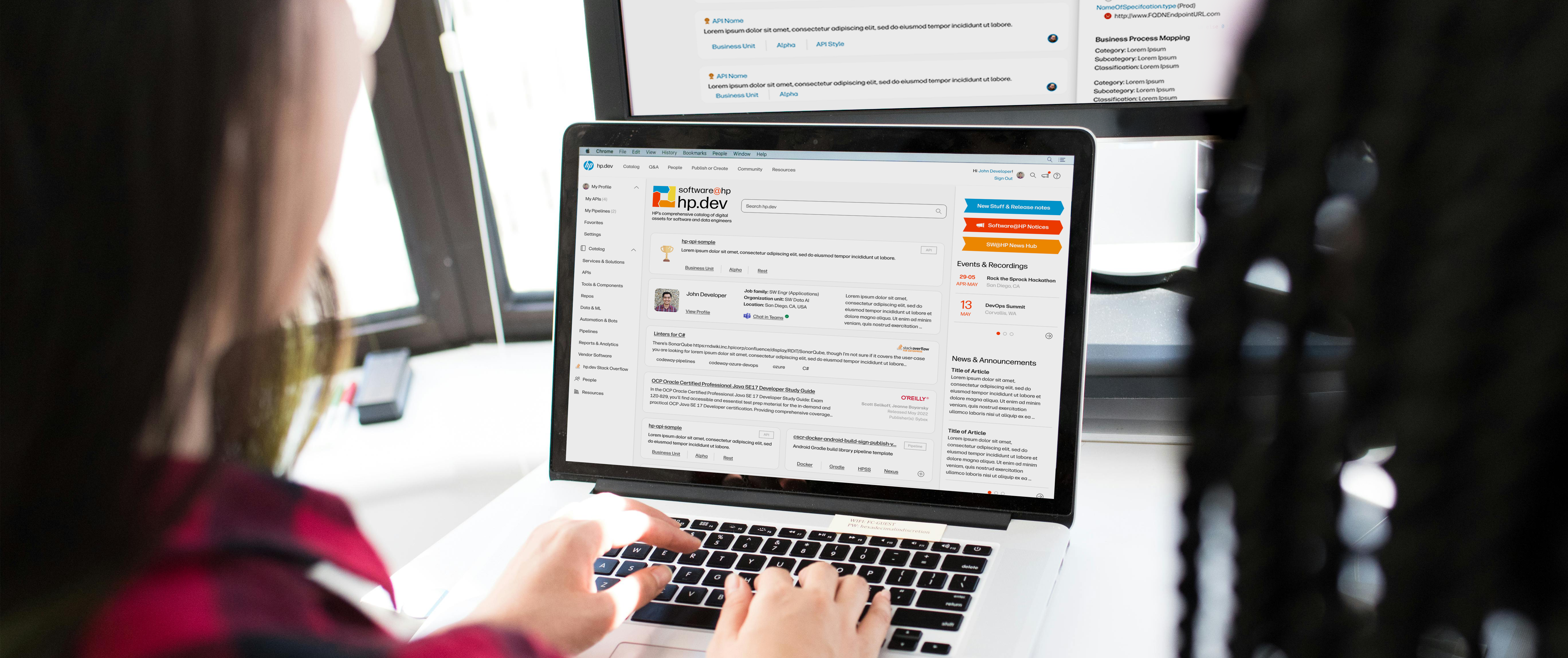
HP's internal developer portal was envisioned as a centralized hub for all tools, services, software, and resources available to employees, a company-wide initiative aimed at empowering teams with the solutions they need to succeed in their roles. The primary objective was to foster peer connectivity and streamline access to essential resources, enabling employees to work more efficiently and reducing redundant efforts across teams. By minimizing rework and surfacing existing solutions, the portal helps developers save time, translating directly into measurable cost savings.
Impact
- Grew a user base to over 3,000
- Exposed over 400 APIs to developers within HP, half of which at Gold status (fully integratabtle without contacting the owner)
- 8% decrease in onboarding time for newly hired developers
- 5% decrease in development time reported by software devs saving HP over $15 million annually
- Personal growth: conducting extensive background research on a specialized user group to create a solution tailored to their unique needs
Process & Role
As the Product Designer for HP DevEx, I led the end-to-end design strategy to ensure alignment with business and user goals. My responsibilities encompassed user research, ideation workshops, feedback sessions, and the development of low- to high-fidelity prototypes across core experiences including API Publishing, Search, the People/Tools Catalog, and User Profiles from initial concept through MVP and into scalable solutions. I successfully championed the adoption of HP Veneer, the enterprise design system, enabling consistent and cohesive digital experiences across teams. The portal design process was highly iterative, and I employed a range of qualitative and quantitative research methods to inform and validate design decisions at each stage.
Planning
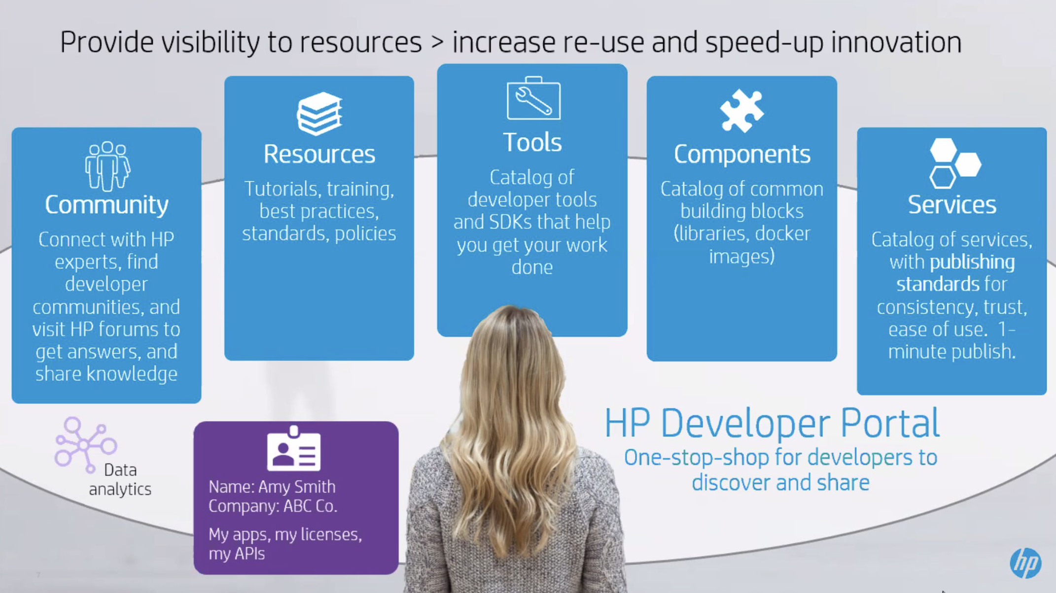
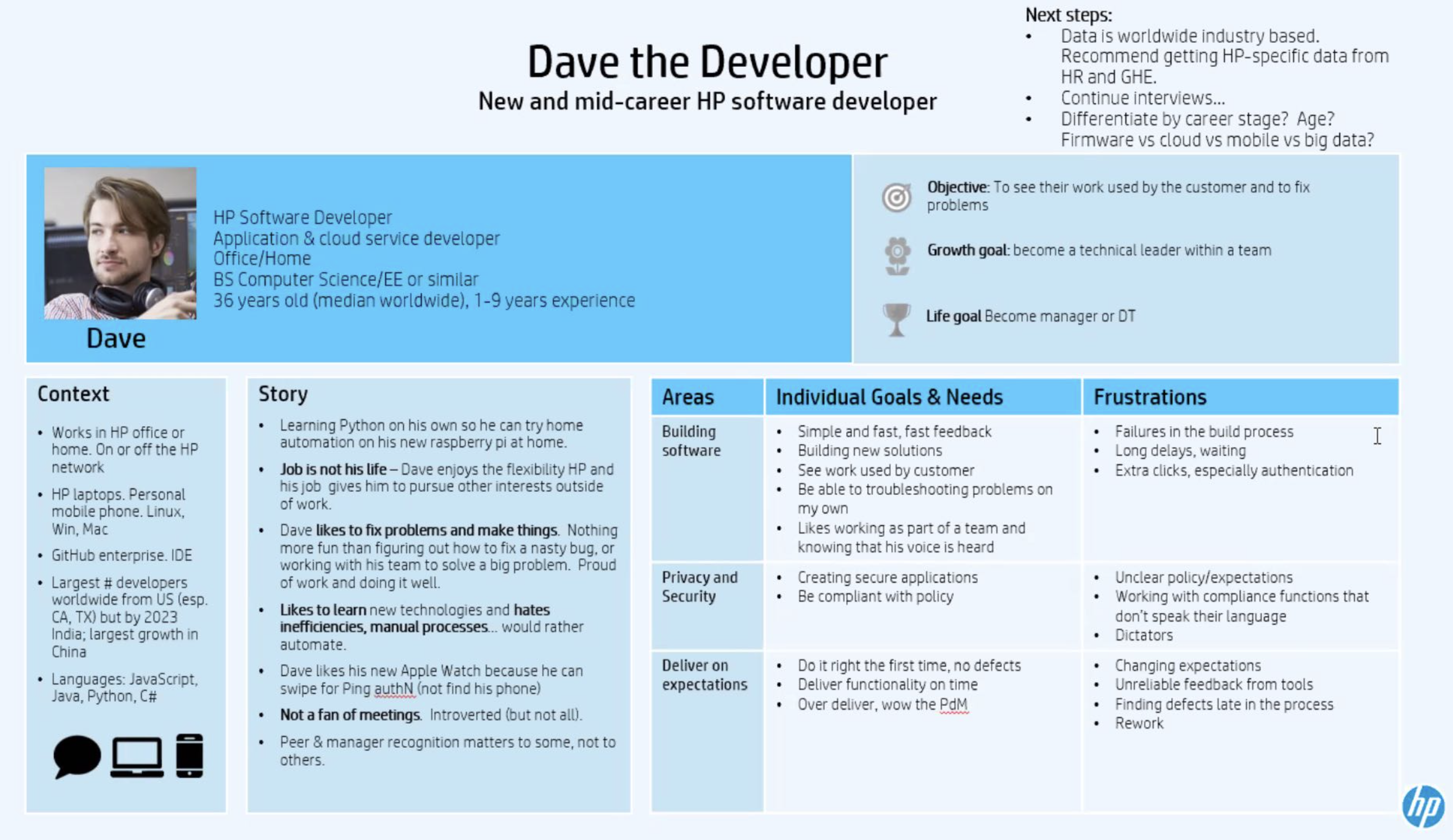
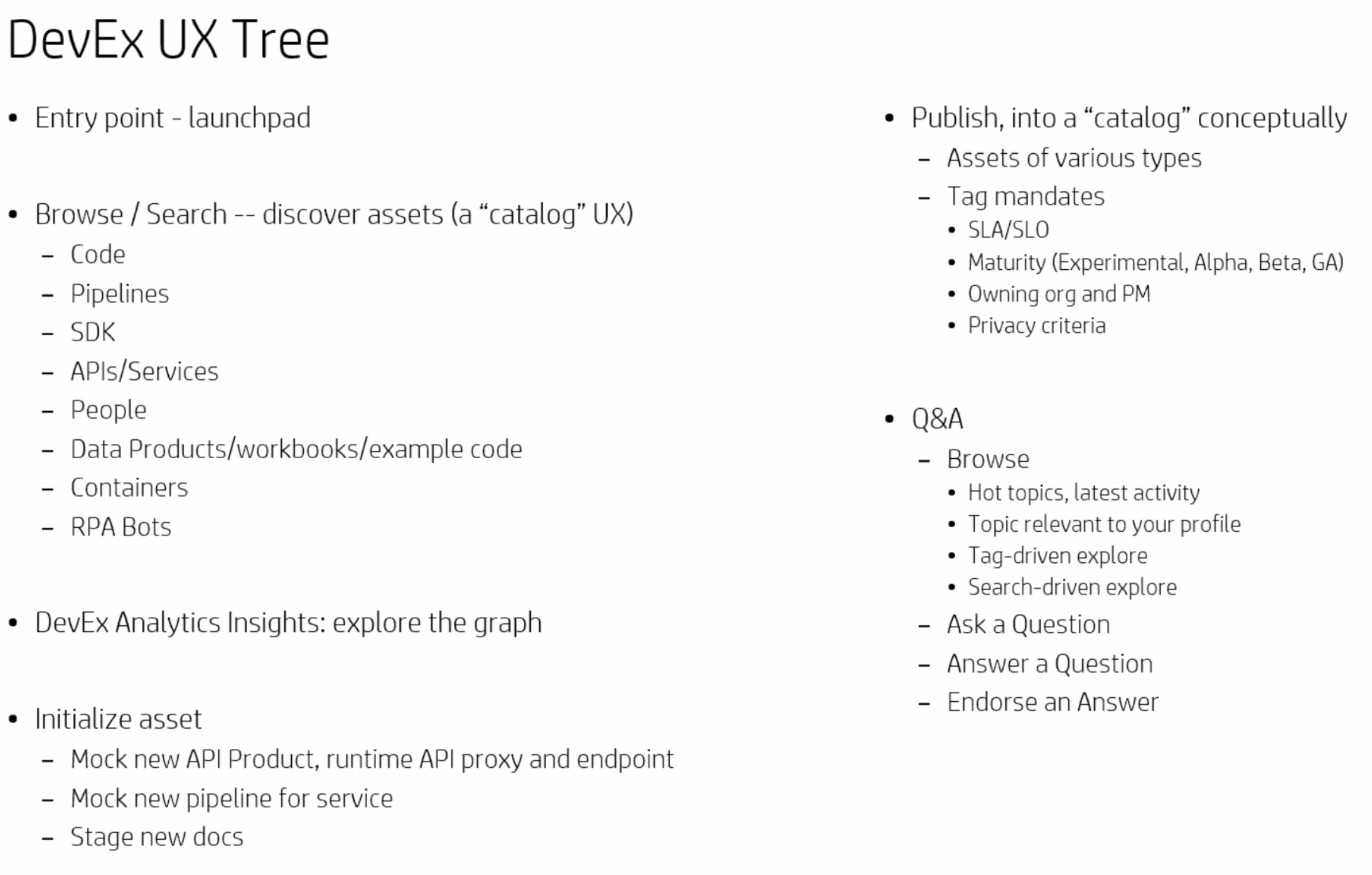
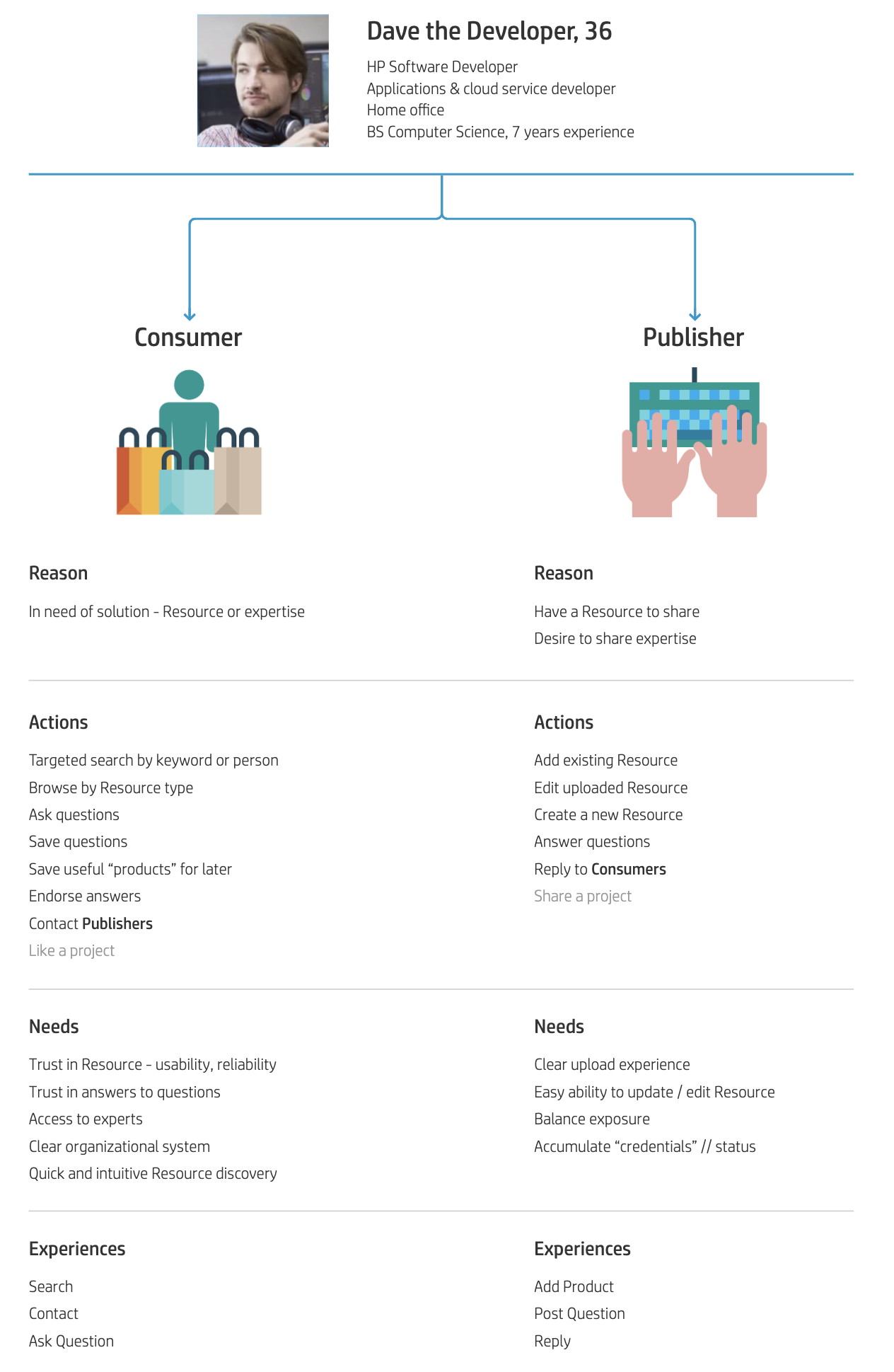
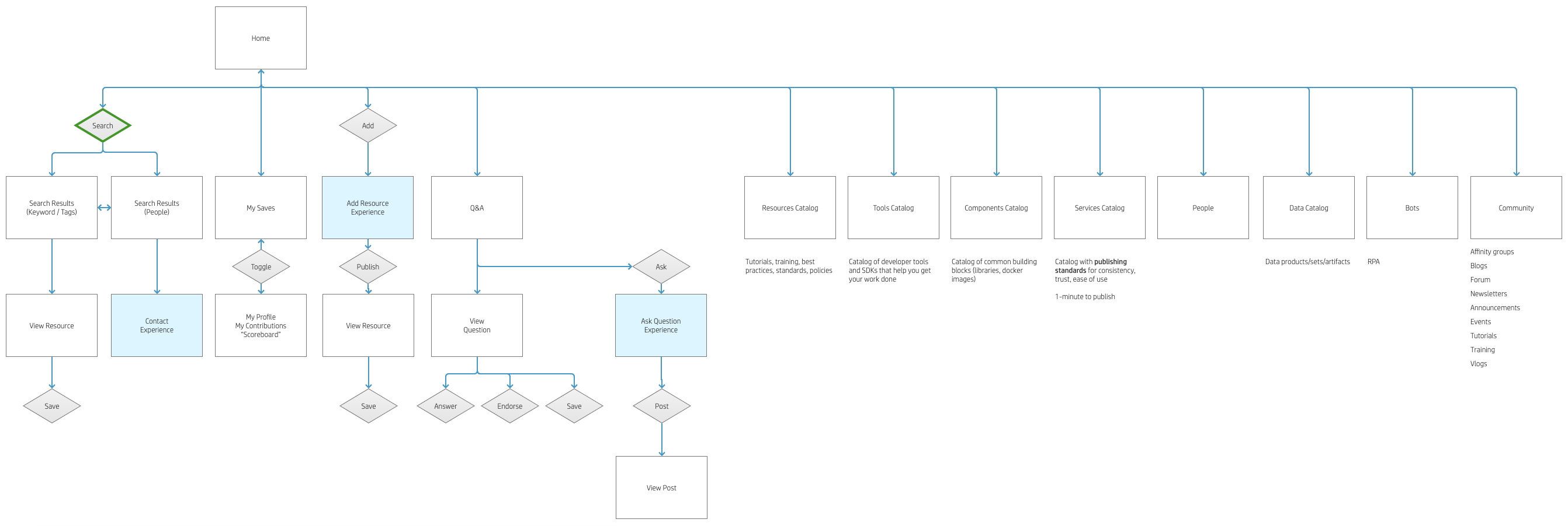
This project was guided by a Design Thinking methodology to deeply understand our users and their needs. Extensive internal research was conducted to identify employee pain points, gather feature requests, and define clear, measurable objectives. I facilitated multiple workshops with users and stakeholders to explore insights, generate ideas, and iterate on potential solutions. Based on this discovery phase, I developed the primary user persona, "Dave Developer," which was further segmented into two sub-personas: the Consumer (content user) and the Publisher (content creator). Using insights from research and ideation sessions, I then created a site map to establish the foundational structure and guide the prototyping phase.
Landing Page
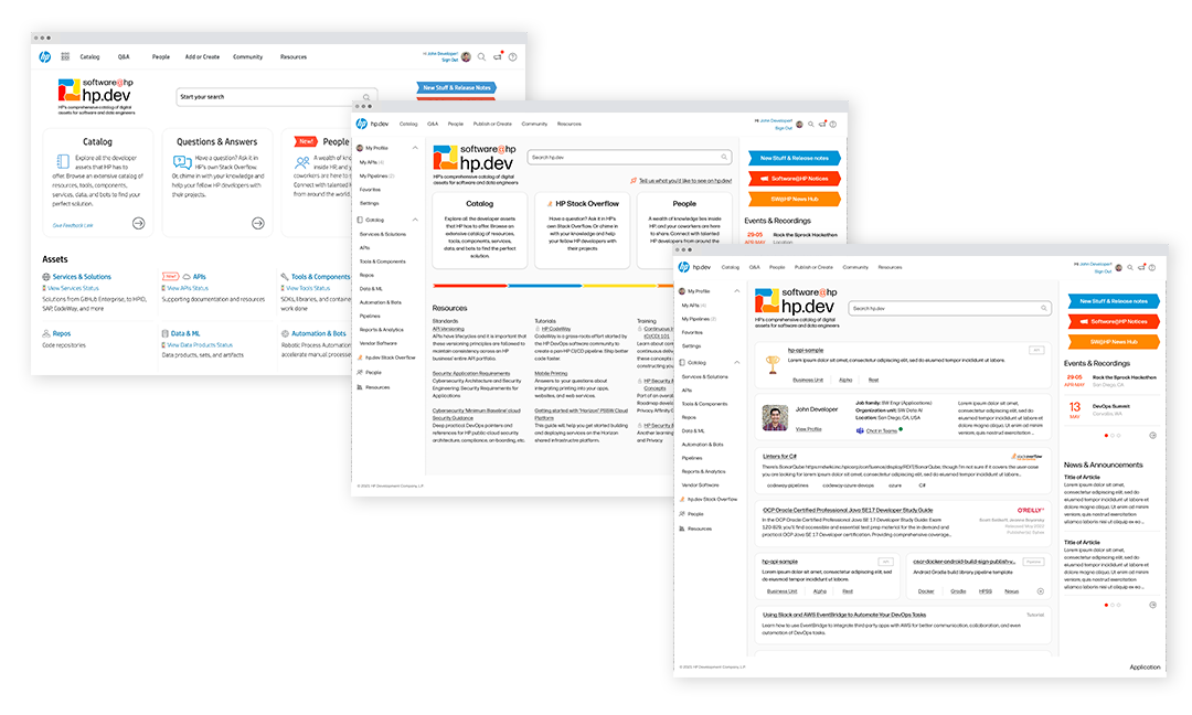
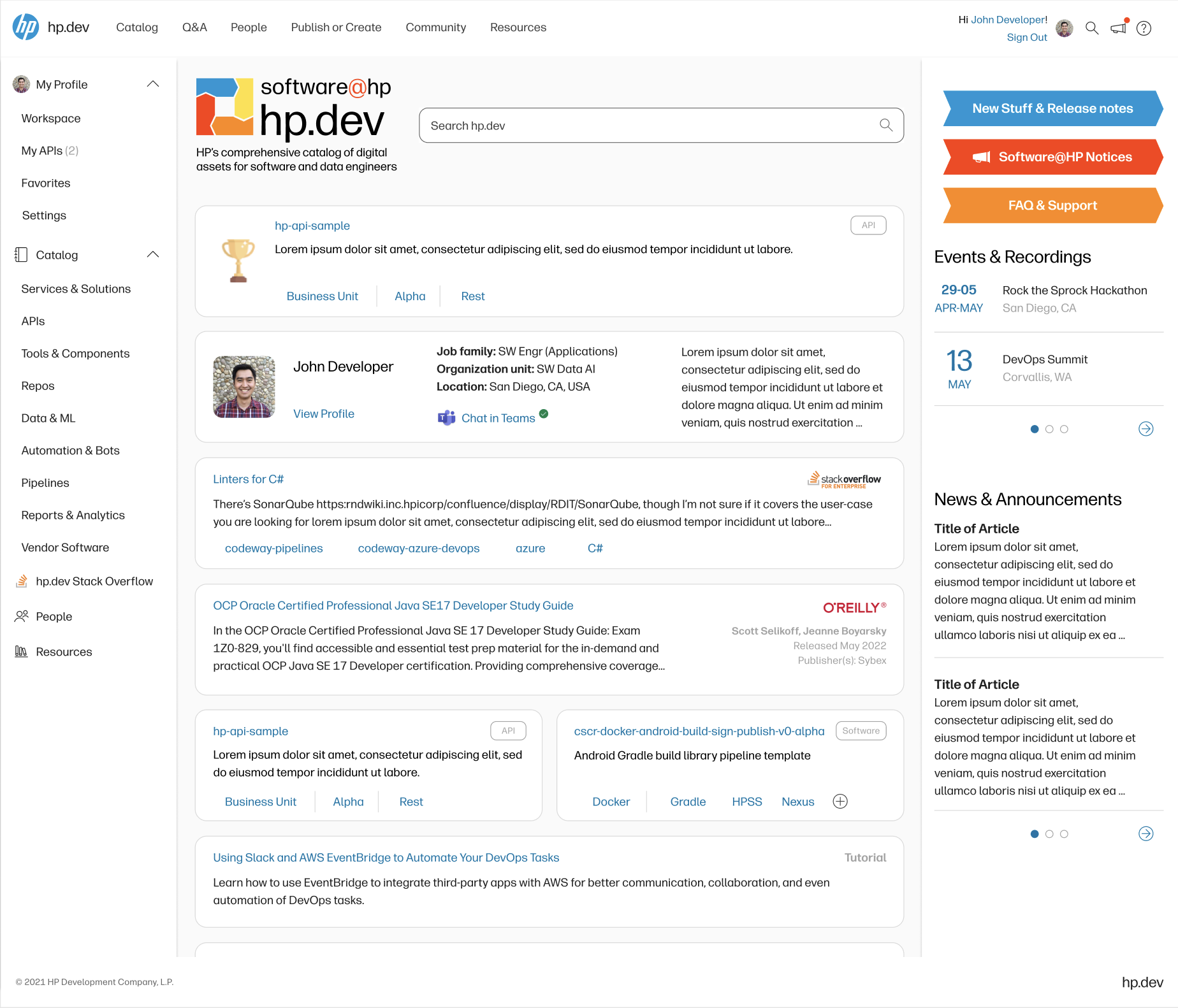
Evolution of landing page from MVP with basic information through to information feed.
The Landing Page was designed to surface key content and direct users efficiently to the solutions they needed. The MVP featured a straightforward list of resources and categories aimed at quickly onboarding users and collecting initial usage data. In the second iteration, the experience was enhanced with a left-hand navigation panel personalized to the user’s profile, alongside a more prominent display of asset catalog categories—the site’s most frequently accessed feature. Based on user feedback and analytics, the third iteration introduced a dynamic, personalized homepage. This version replaced the static layout with a content feed tailored to the user’s role and network, transforming the portal from a simple utility site into a discovery hub for internal tools and resources. This enhancement led to a notable increase in both unique and repeat homepage visits.
Search Results
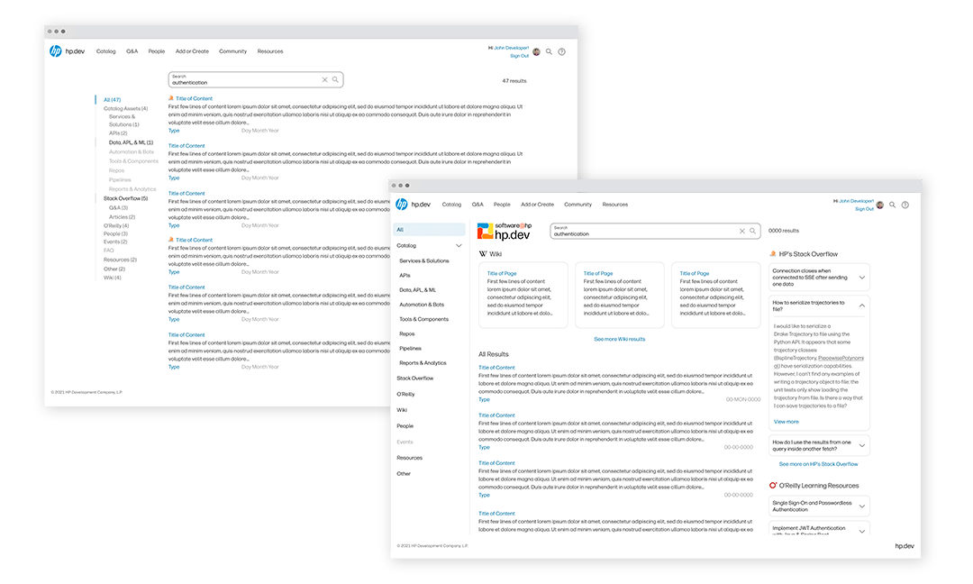
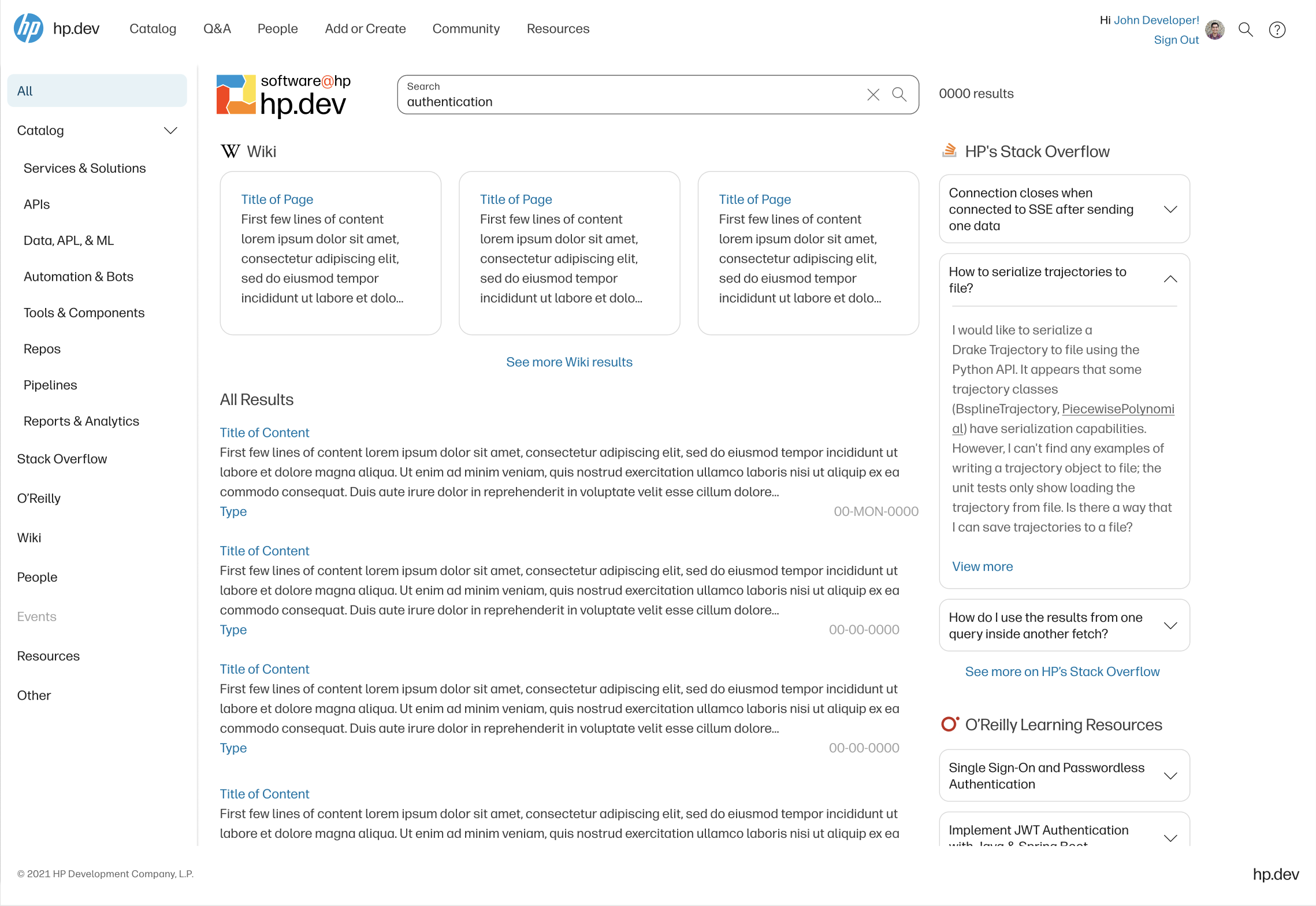
Search: MVP (left) and iterated design (right)
The MVP Search functionality launched with a minimal design—a basic relevance-based list with category and type filters. Initial user interviews indicated a preference for a simple, scrollable list featuring essential data and preview information for quick browsing. However, post-launch user behavior revealed deeper needs that informed a redesign. The updated Search experience introduced frequently used filters as top-level suggestions, improving accessibility, while expandable preview data allowed users to view more information without overwhelming the interface. As a result, Search analytics showed increased usage, reduced reliance on manual filtering, and a shorter time spent on results before navigating away—indicating that users were finding relevant content more efficiently and returning to their primary tasks more quickly.
Asset Catalog
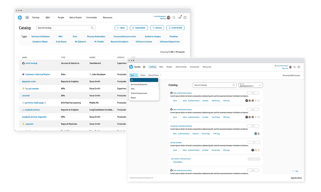
Asset Catalog: MVP (left) and iterated design (right)
The primary goal of the Asset Catalog was to enable users to efficiently search HP's internal
catalog of tools and services, discover solutions relevant to their current projects, and
implement them seamlessly. The MVP launched with a basic asset list and filtering by asset type
to establish a foundation for user behavior tracking and to gather insights through interviews
with “power users.” I mapped user journeys to identify key pain points and opportunities for
improvement.
Based on findings from the MVP, I redesigned the experience to enhance discoverability through
improved sorting, filtering, and search functionality—critical as the catalog rapidly scaled.
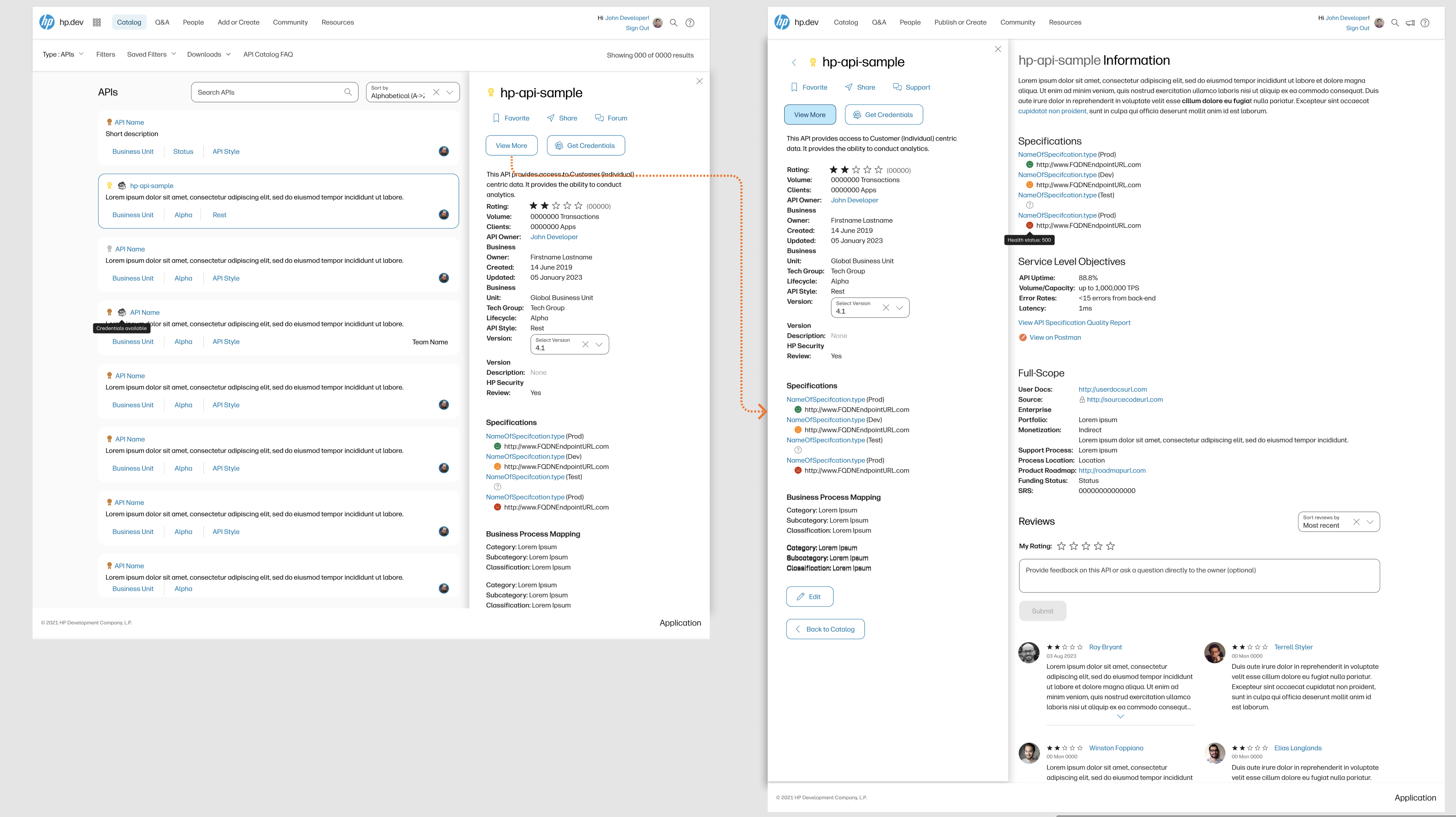
The discovery experience was structured in three progressive phases: card preview, sidebar
detail, and full asset view. Each stage was designed and tested to provide just enough
information to help users evaluate relevance without overwhelming them, enabling quick
decision-making. Additionally, filtering and sorting were tailored to the specific
characteristics of each asset type (e.g., APIs, pipelines), ensuring a more contextual and
intuitive experience.
Workflow compiled from user interviews
User journey for API discovery from user interviews
Full asset discovery from card (left), sidebar (middle), to full page (right)
API Upload
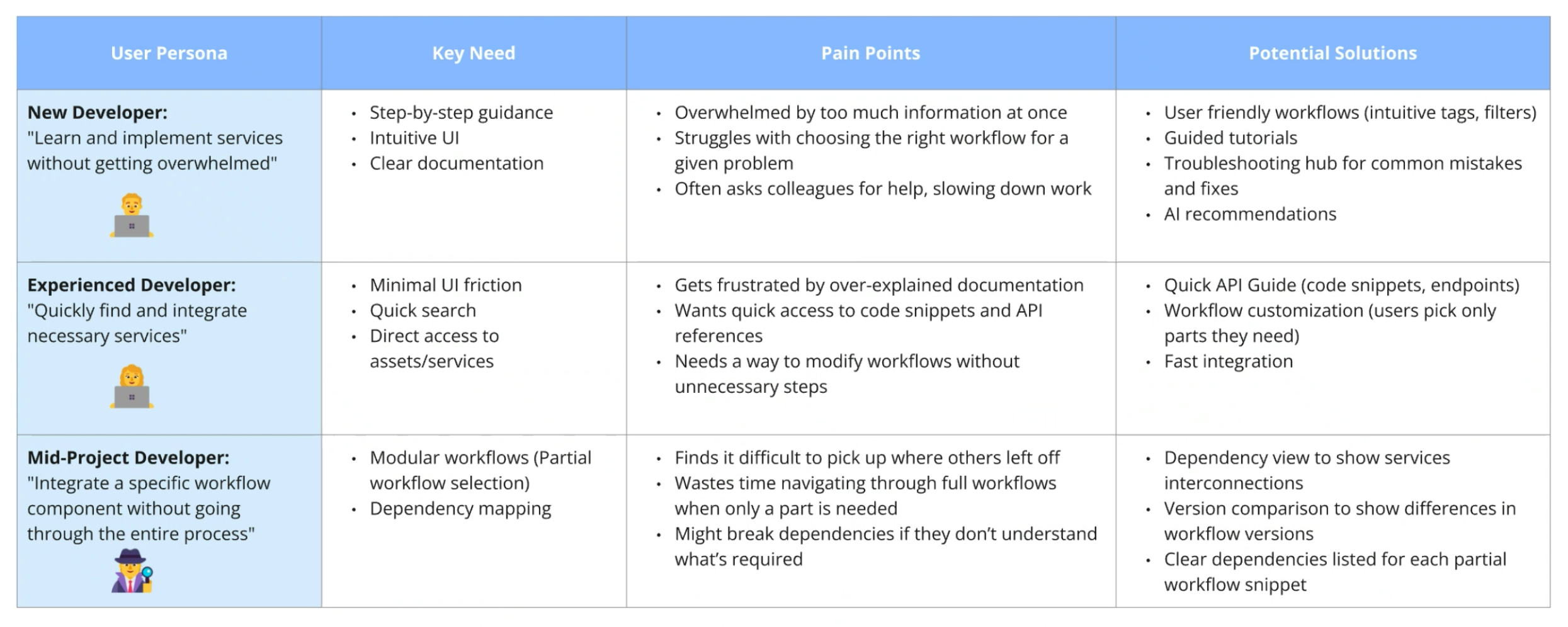
Initial brainstorming and understanding user pain points through interviews
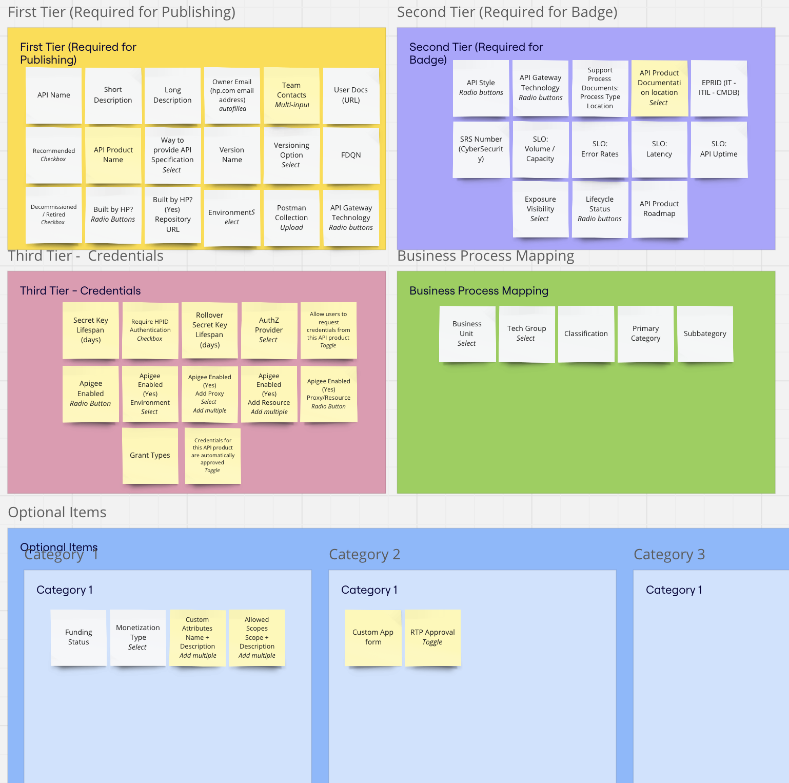
Card sorting exercise example
One of the most highly anticipated features of the HP.dev portal was the ability for
developers to share internally developed APIs, helping to reduce redundant work across teams
and directly supporting the Asset Catalog. Within HP, it was common for multiple teams to
independently build similar APIs without knowing others already existed. By enabling
internal sharing, this feature aimed to promote reuse and accelerate development.
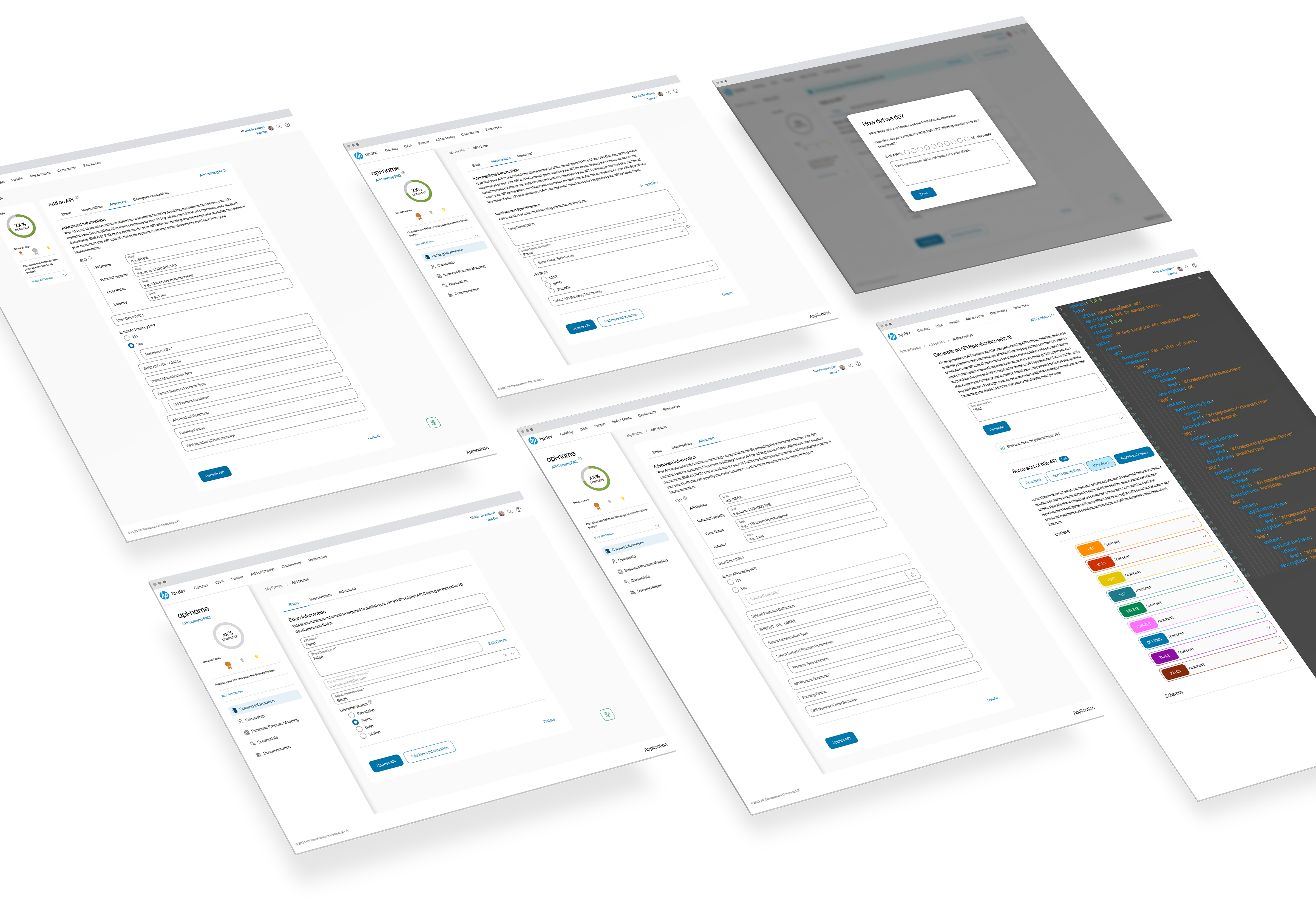
To publish an API, owners are required to complete a detailed submission process involving
numerous data fields—a task that was initially complex and time-consuming. Through several
iterations of usability testing, I refined this experience to reduce cognitive load and
improve user flow. The original design featured a single-page form containing all input
fields, under the assumption that one consolidated page would be simpler. However, user
feedback indicated it was overwhelming. In response, I conducted user research, including a
card-sorting exercise in Miro, to understand how users mentally model API information. This
insight helped inform a more intuitive, step-by-step flow that segmented the data entry into
manageable sections.
To further encourage completeness, I incorporated a gamification element tied to the API’s
status, incentivizing owners to fully populate their API entries. This results in richer,
more valuable content for users searching the Asset Catalog.
Looking ahead, planned enhancements for the API submission experience include batch uploads
and AI-assisted API creation to further streamline the process.
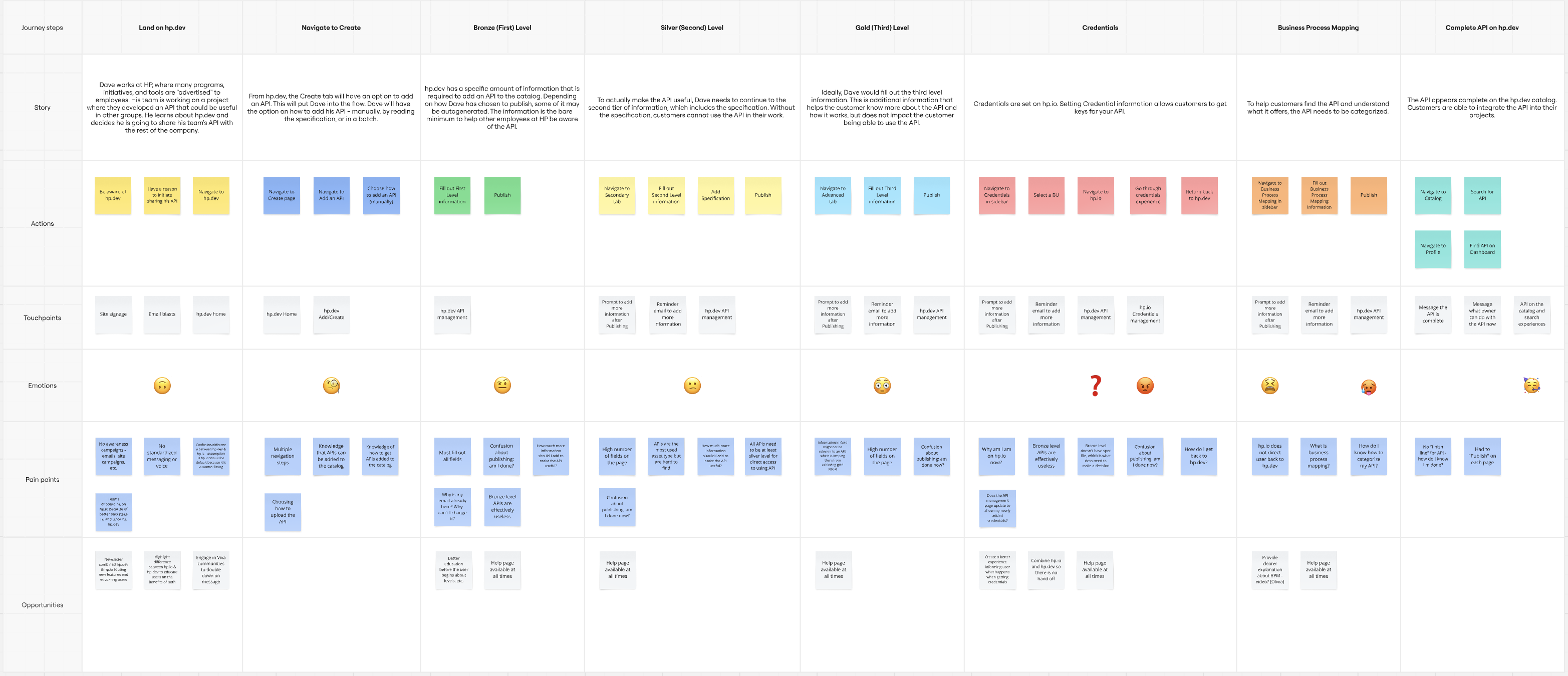
User journey for API publishing
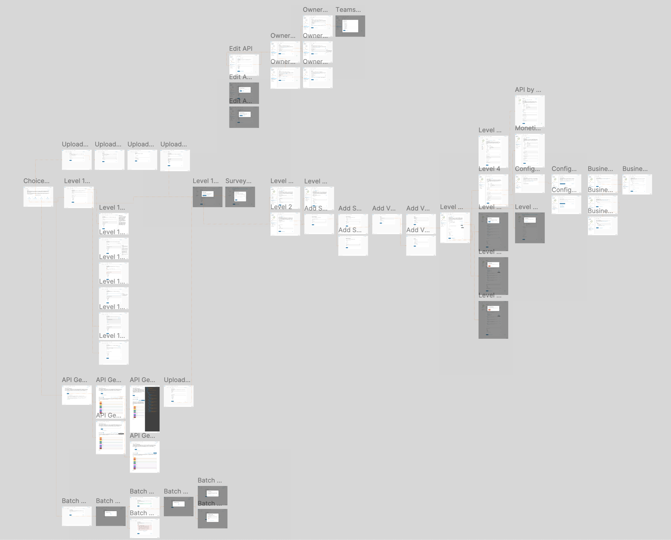
End-to-end API Publishing flow in Figma. The prototype is live and allowed for user testing simulating an implemented experience.
Iterative Design
The portal is an ongoing initiative, continually evolving through user feedback, usability testing, and empathy-driven interviews to enhance the overall user experience. The long-term vision is to create a centralized platform where technical professionals across HP can connect, collaborate, and exchange expertise—ultimately driving process improvements, fostering innovation, and enabling more effective knowledge sharing across the organization.