HPiD
HPiD is a company-wide authentication system that provides users with a unified sign-in and account creation experience across all HP products, services, and platforms. Designed for convenience and security, HPiD ensures users can seamlessly access the HP ecosystem with a single set of credentials.
Goals
- Seamless account creation: Quick and intuitive with email address, mobile number, or federated logins.
- Multi-platform access: Consistent experience regardless of customer touchpoint across web, mobile, and HP apps
- Enhanced security: Support multi-factor authentication (MFA) and passwordless sign-in (OTP, passkeys) for added protection.
Impact
- Resdesign: 12% reduction in abadoned account creations
- Resdesign: 15% increase in successful sign ins
- OTP Integration: 18% reduction in Forgot passsword link usage
- OTP Integration: 14% reduction in Invalid credentials error
- OTP Integration: 33% user conversion to OTP
- Successfully advocated for Passkey integration
- Personal growth: consolidating diverse user groups with varying needs and requirements into one design solution
Role
As the lead UX designer for HPiD, my objective was to deliver a faster, more intuitive user experience. The existing account creation and sign-in flows had a high drop-off rate, leading users to abandon their tasks, particularly impacting services such as printer and ink subscription management, and resulting in lost conversions on the HP Store. Additionally, the UI had not been updated to align with HP’s current brand standards, leading to a disjointed and inconsistent user experience. As part of the redesign, I successfully advocated for the adoption of HP Veneer, the enterprise design system that enables cohesive and scalable digital product development across teams.
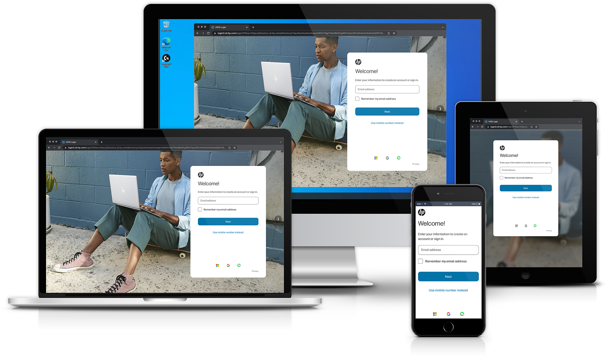
The initial HPiD create/sign-in experience.
Initial testing
Leveraging analytics data to validate assumptions about customer pain points, I developed
multiple iterations of potential design solutions for the account creation experience. Each
concept was translated into a fully interactive prototype representing a distinct approach to
improving usability. These were tested alongside a prototype of the existing experience to
evaluate intuitiveness, ease of use, and overall effectiveness. User feedback also provided
critical insights into what was not working in the current flow.
Each prototype addressed a specific pain point: one split the required information across two
screens to reduce cognitive load; another removed the mobile number requirement to streamline
input; and a third minimized scrolling by compressing input fields into a more compact layout.
The findings from these tests informed the final design direction, ensuring the solution was
grounded in real user needs and behaviors.
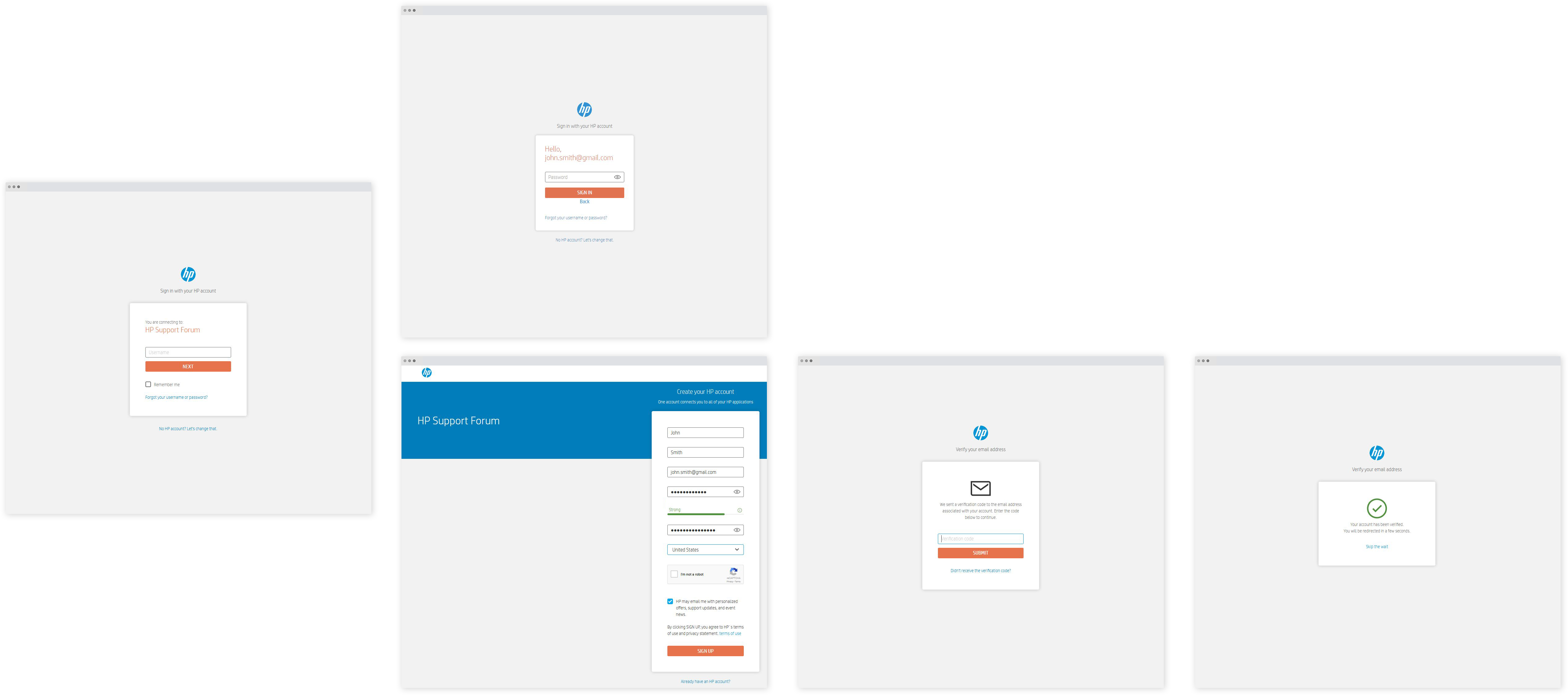
New HPiD experience options for testing as well as the current design.
Findings
Users first navigated through the existing HPiD experience, and I gathered their impressions
through feedback sessions. The majority of participants noted that the form had an excessive
number of fields and password requirements. Many users expressed difficulty in locating the
option to sign in with an existing account and were uncertain about whether it was possible to
create an account without providing a mobile number. Concerns were raised about receiving
unsolicited corporate communications or having personal information sold.
Based on this feedback, I identified key areas for improvement. Users preferred a streamlined
account creation process with fewer fields, which allowed them to complete the flow more
efficiently. While they felt that including their name was unnecessary, they appreciated that
their email address (or mobile number) could serve as their username, eliminating the need to
remember additional login credentials
First iteration
Redesigned Create Account (top) and Sign in (bottom) flows.
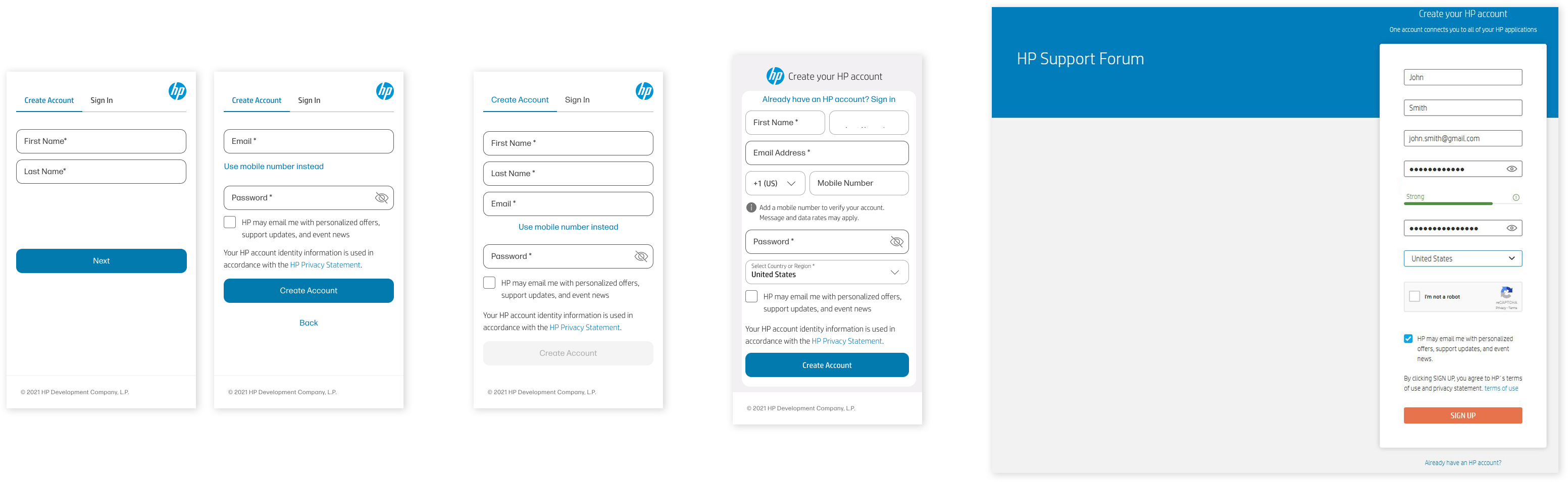
The first iteration addressed several key issues raised by user testing. To improve navigation,
the toggle between "Sign In" and "Create Account" was relocated to the top of the page, reducing
the need for users to scan the interface for their preferred action. The number of fields in the
initial account creation flow was minimized: the mobile phone number and region fields were
moved to a separate page, with both marked as optional. Additionally, the region was
auto-selected based on the user's metadata, further streamlining the process.
The verification flow was redesigned to hide the verification code input field, encouraging
users to complete the verification process more seamlessly via the email button, which provided
a faster, more intuitive experience. While users felt the "Name" fields were unnecessary,
marketing stakeholders insisted on retaining them, citing data showing users preferred having
support and marketing communications address them by name.
Due to technical constraints, we were unable to implement a single Email/Mobile number field for
the sign-in experience. Instead, a toggle link was added within the input field to allow users
to easily switch between options. To ensure consistency across platforms, the experience was
designed on a card that maintains the same size across web, tablet, and mobile devices. This
layout also adapts to partner applications, whether displayed in app windows or embedded within
web views. Additionally, the background image on desktop and tablet platforms can be customized
according to partner preferences.
Following the implementation of this design, the abandonment rate for account
creation decreased by 12% while successful sign-ins increased by 15%.
Additional Screens
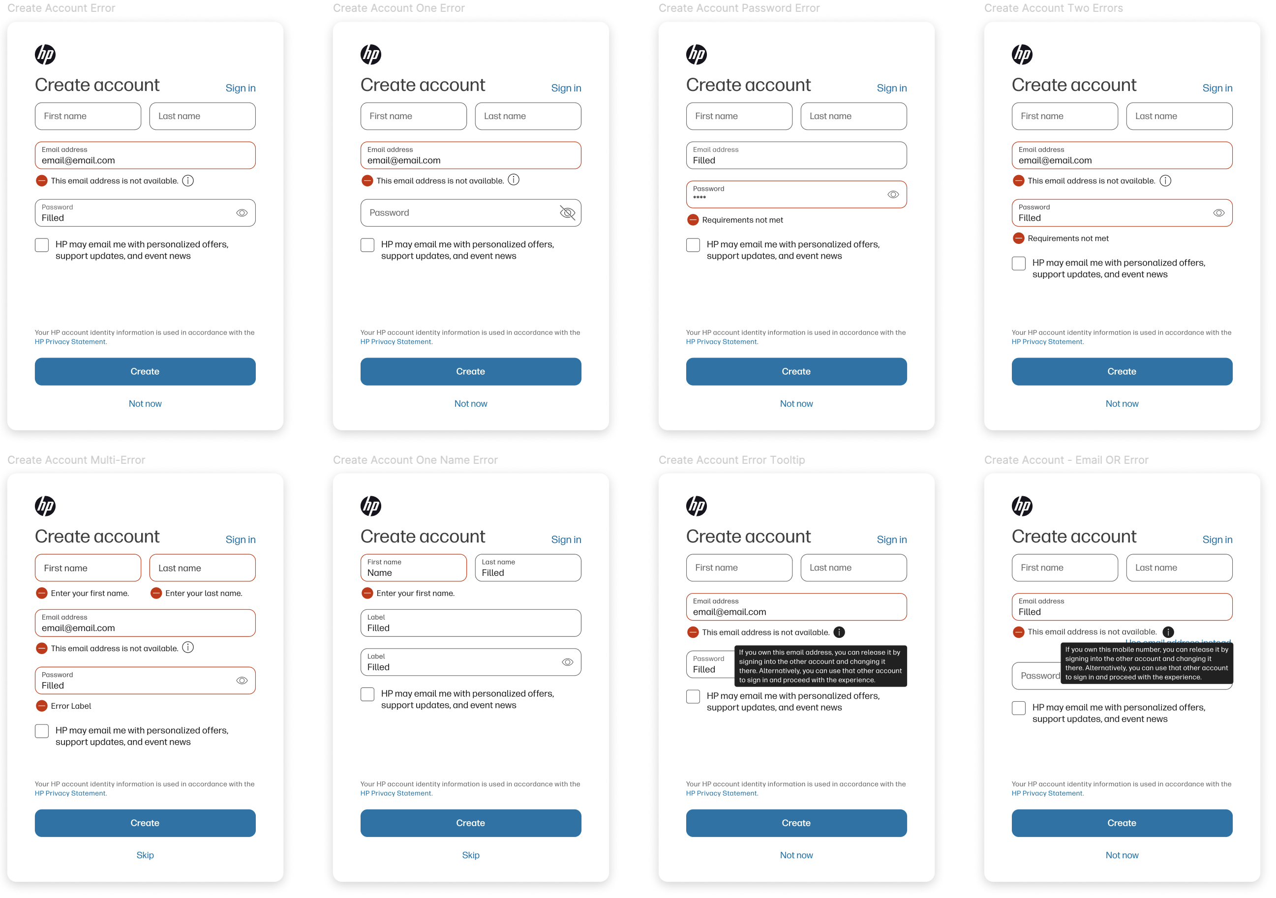
Examples of the Create screen error states
With the redesign of HPiD, every error message, edge case, and alternative flow was carefully reviewed and redesigned. We also took the opportunity to update messaging and flows to align with industry best practices. Many of the messages underwent rapid A/B testing to ensure clarity and conciseness, enabling users to quickly understand the situation and make informed decisions.
Global view

Create flow, alternative screens, error messaging, and Federated experience
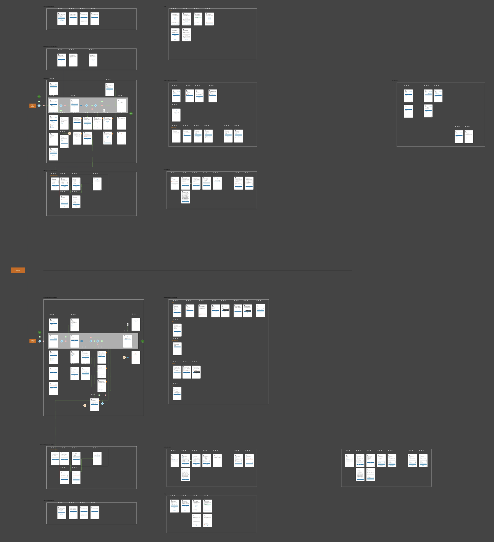
Sign in flows (email address and mobile device), alternative screens, error messaging, and multi-factor authentication
New Technologies
The next phase for HPiD involved integrating new technologies to enhance the user
experience. After researching multiple options, One-Time Passcode (OTP) was chosen as the
first solution, with the ultimate goal of transitioning to Passkeys. To deepen our
understanding of emerging sign-in technologies, I attended the FIDO Alliance Authenticate
2024 conference, where I engaged with designers from other companies to learn about their
approaches to modern authentication experiences.
Upon returning to HP, I collaborated with a UX strategist to develop a comprehensive testing
plan that included multiple user sessions. These sessions were designed to incrementally
test the new design, flow, and variations in messaging.
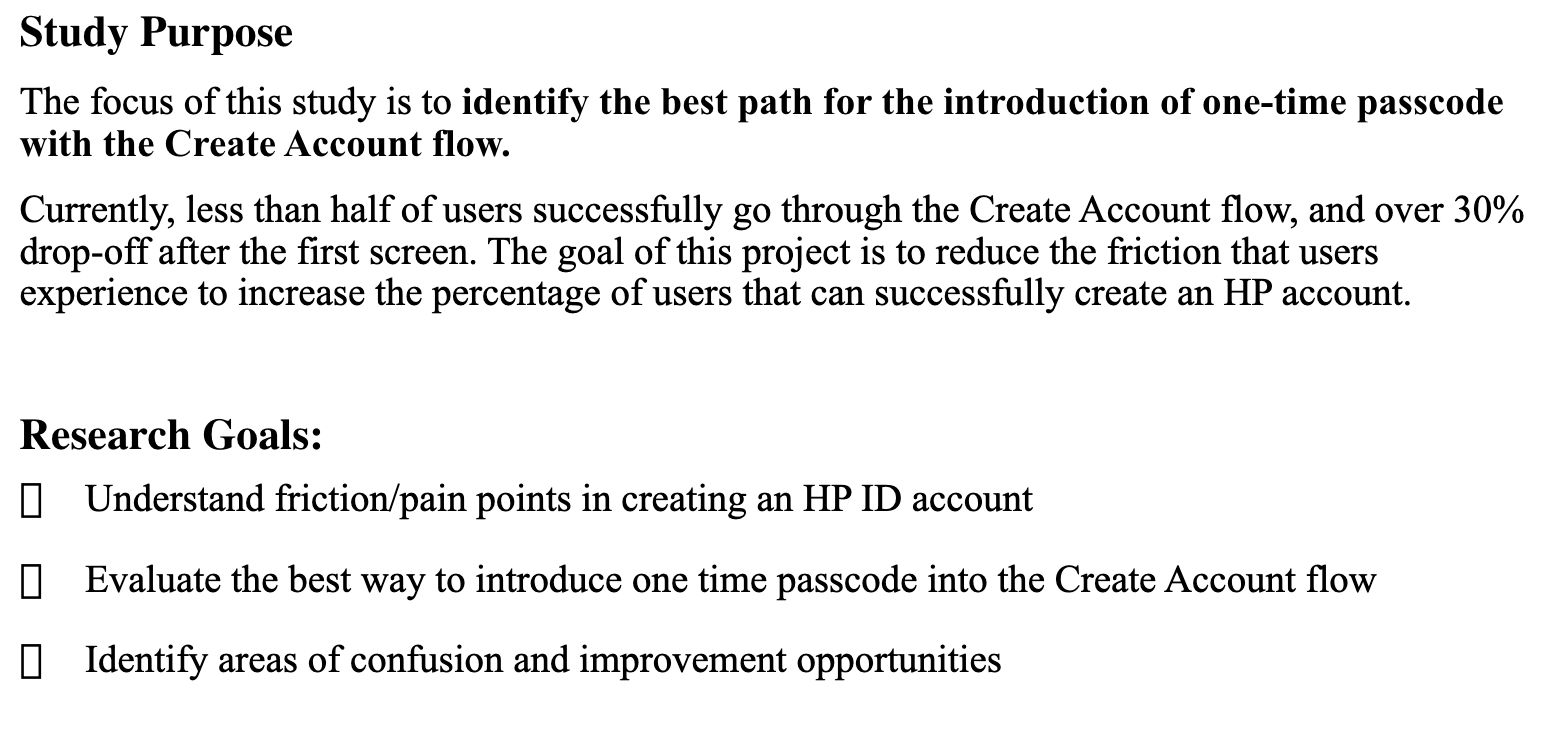
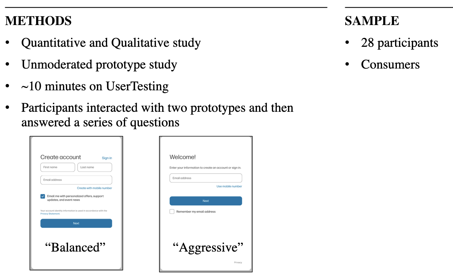
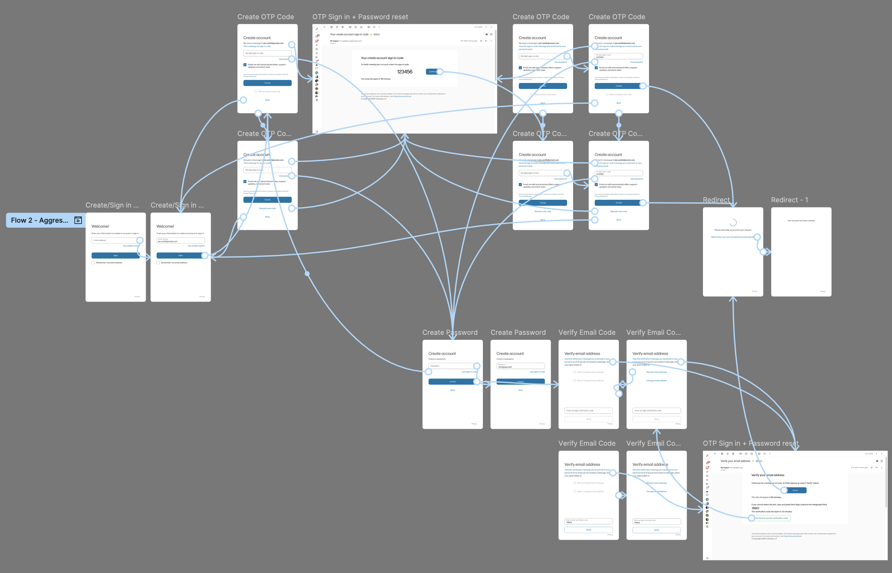
The primary objective of the test was to determine the optimal integration of the OTP
experience within the account creation flow. I developed two distinct flow options: one
representing a "Balanced" redesign of the existing flow, and the other offering a more
streamlined, simplified approach. To evaluate these options, I created two live, end-to-end
prototypes, which were presented to 28 users. Half of the participants experienced the
"Balanced" flow first, while the other half began with the "Aggressive" flow. The tests were
conducted as moderated walkthroughs, allowing us to observe and gather real-time feedback on
user interactions, pain points, and overall experience with each flow.
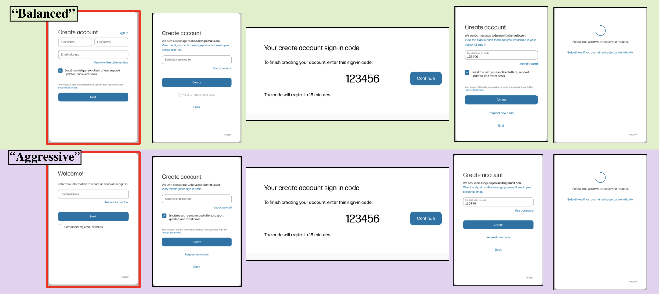
Results
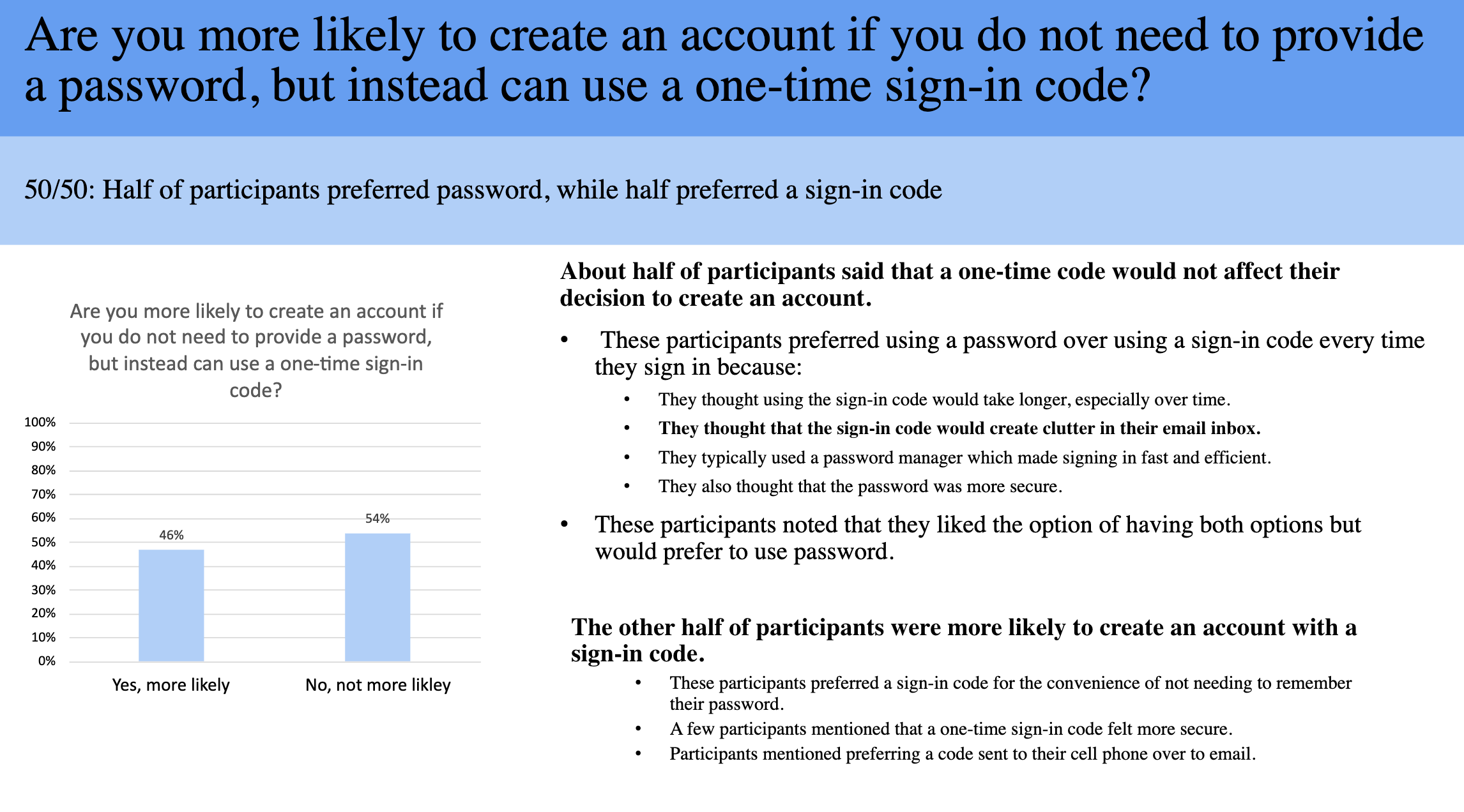
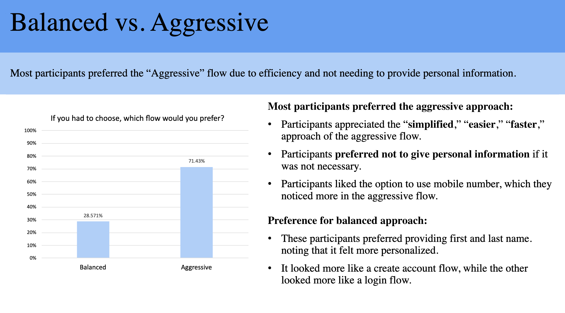
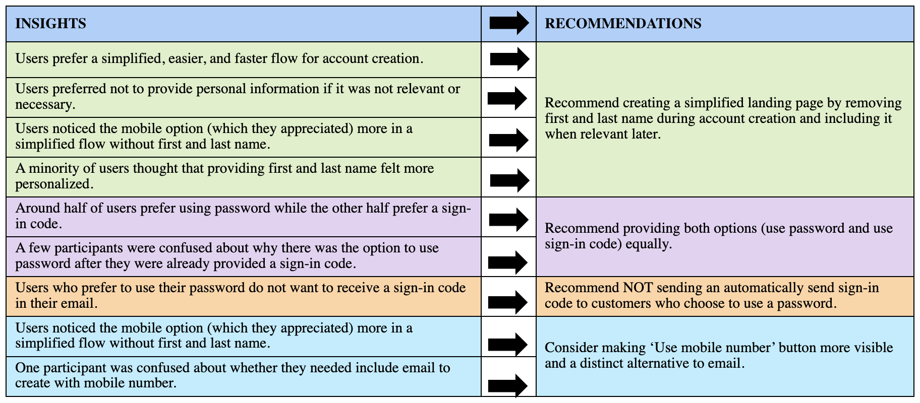
User testing revealed a clear preference for the "Aggressive" flow, primarily due to its
perceived simplicity. Users appreciated not having to input unnecessary information, such as
first and last names, when it was not relevant to the current step. They also noticed the
mobile toggle more frequently and valued the option to skip the password field for a faster
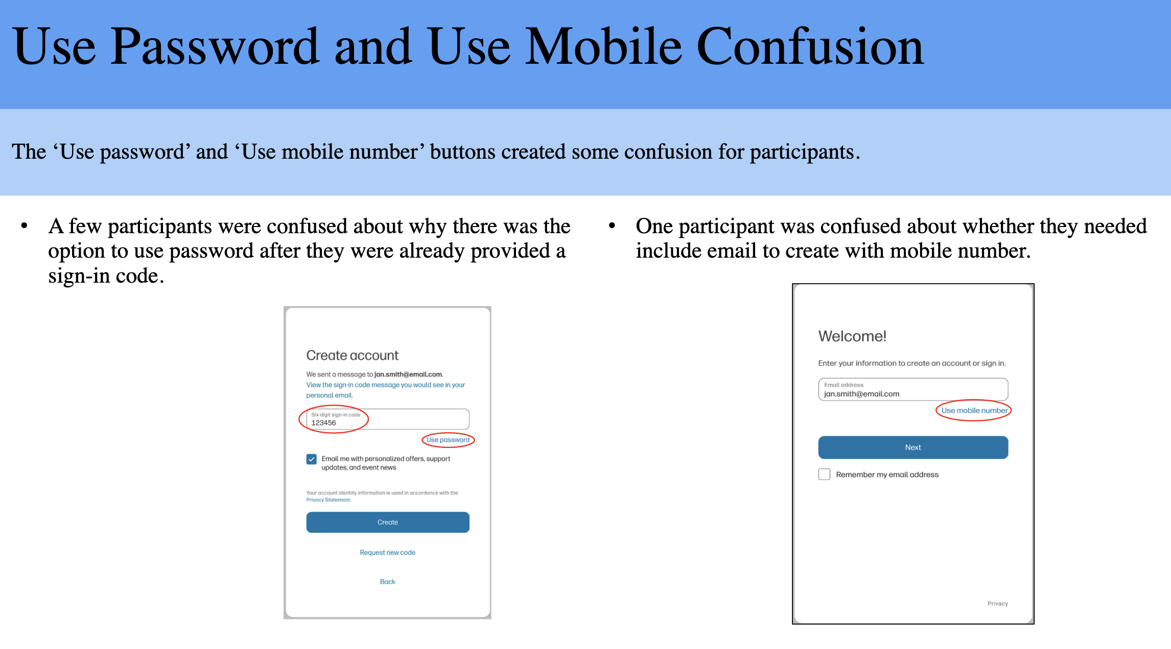
experience. However, there were areas for improvement. Some users had difficulty locating
the mobile sign-in option, and there was confusion about whether both a mobile number and an
email address were required. Additionally, stakeholders from HP Support were not in favor of
removing the name fields.
Using the data collected from user testing, I recommended developing a "hybrid" design that
combined the best features of both the "Aggressive" and "Balanced" flows, incorporating
elements that addressed user preferences while maintaining alignment with stakeholder
requirements.
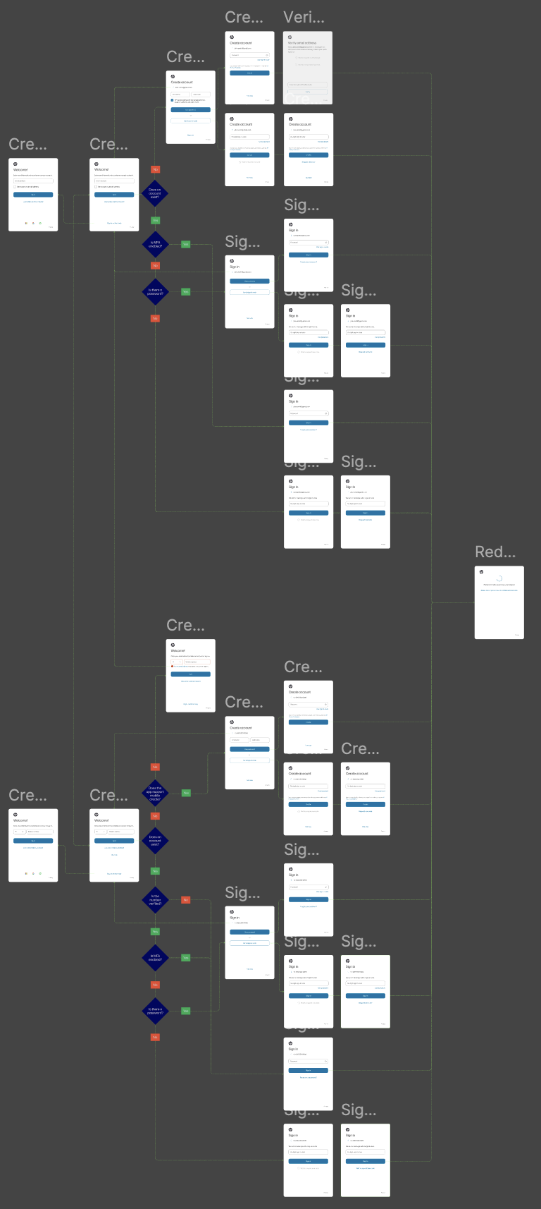
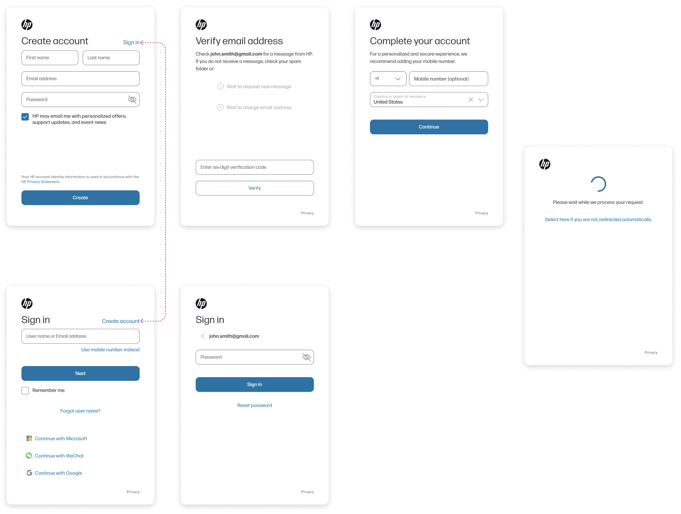
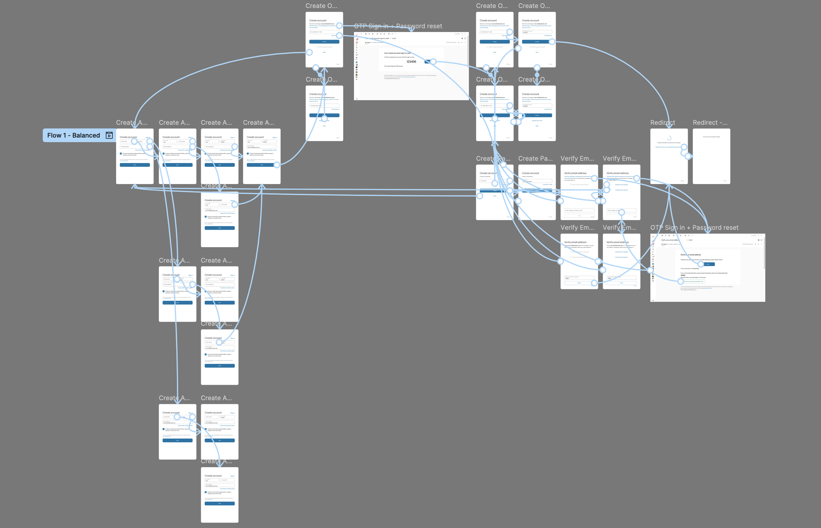
The entire Sign in / Create flows with OTP
OTP Design
The release of the OTP design integrated the best elements of both the "Balanced" and
"Aggressive" flows, while addressing the issues identified during user testing. Rather
than using a toggle between sign-in and account creation, the flow begins with a single
Welcome screen that prompts users to enter their identifying credential. Upon selecting
"Next", a backend request is made to determine whether the account exists. If the
account is found, the user is directed to the Sign-In flow; if not, they are taken to
the Account Creation flow. The toggle between email address and mobile number was
replaced with a more prominent button, offering users the option to switch credential
types. This change was intended to make the toggle more noticeable and distinguish it
clearly from the input field above.
Once the user is identified as being associated with an existing account or is a new
user, they are presented the option to either use their traditional password or opt for
the OTP method. For the Account Creation flow, the account verification step was
eliminated unless it is required for specific applications, such as the HP Store. The
verification step had been a significant pain point, as users often questioned its
necessity, leading to the highest abandonment rate during account creation. Additional
components of the flow include multi-factor authentication (MFA) sign-in, account
verification processes where applicable, and the management of all associated error
states.
Additional testing
For the MVP release, I added the OTP option on the Sign-In screen and utilized Optimizely to
present two distinct messaging options to users, enabling us to gather data on their
comprehension of the OTP technology. Our primary concern was that users unfamiliar with OTP
might avoid the option, despite its offering of a faster and more efficient experience. The A/B
testing ran for a month, with 50% of users receiving the message "Use one-time passcode" and the
other 50% receiving "Send sign-in code." The results indicated that "Send sign-in code"
resonated better with users, as it led to higher success rates in both Sign-In and Account
Recovery flows, confirming that more user-friendly wording facilitated a smoother experience.
Users that choose OTP process for Sign in: 33%
Forgot passsword link usage dropped ~18.36% after OTP enabled
Invalid credentials error dropped ~ 13.89 % after OTP enabled
OTP Sign ins
• "Send sign-in code": 53%
• "Use one-time passcode": 47%
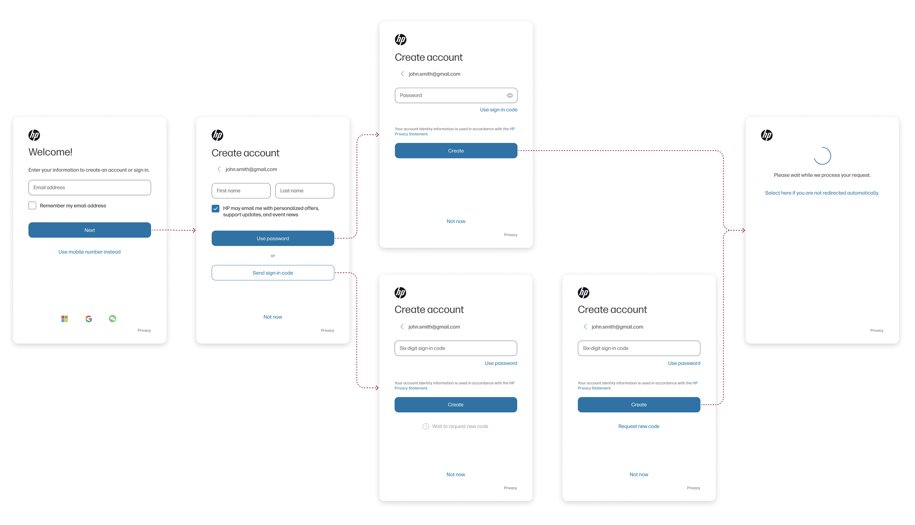
OTP basic Create flow
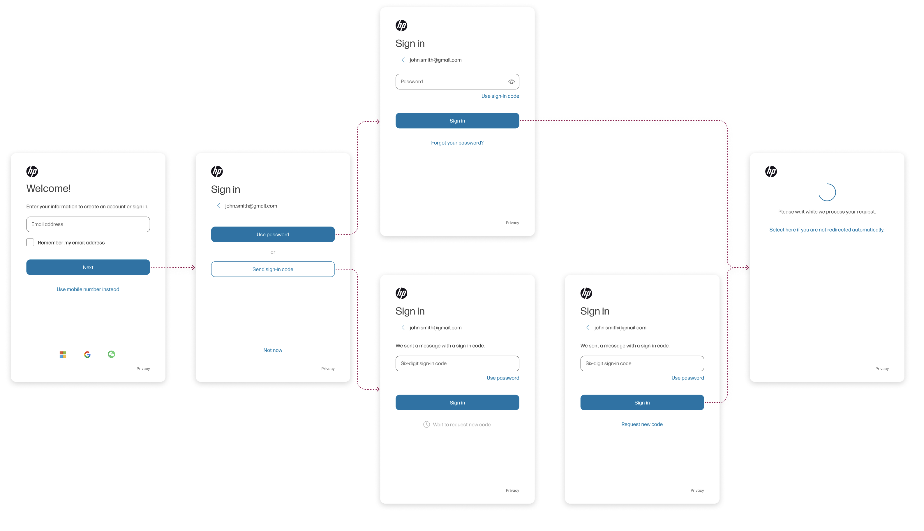
OTP basic Sign in flow
Next Step - Passkey Integration
Over 80% of security breaches involve compromised usernames and passwords, and account recovery
processes are both burdensome for users and costly for organizations. Account recovery alone
accounts for 50% of call center volume, with companies spending an average of $70 per
call, translating to approximately $1.5 million annually for every 5,000 users. Furthermore,
two-thirds of users report feeling overwhelmed by digital identity management, with over 30%
using weak passwords across multiple accounts. Given the challenges of the current digital
identity management ecosystem, I have advocated for the integration of a passkey experience
within HPiD.
A passkey is a digital credential that allows users to sign in to websites or apps without the
need for a password. The process involves creating a cryptographic key pair: a private key
stored securely in the user's device wallet, and a public key stored on the application server.
Passkeys can be seamlessly integrated into the existing sign-in flow, leading to higher user
success rates, reduced support calls and account recovery requests, and a faster sign-in
process. My role has been to build a compelling case to persuade stakeholders and partners to
invest in passkeys, significantly enhancing the HPiD user experience.
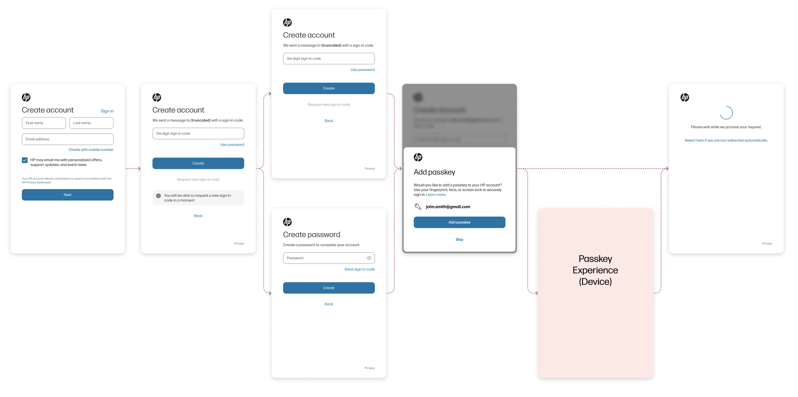
Mock Passkey integration flow
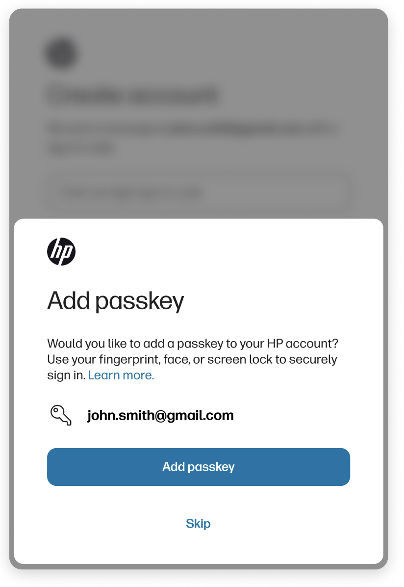
Passkey integration screen