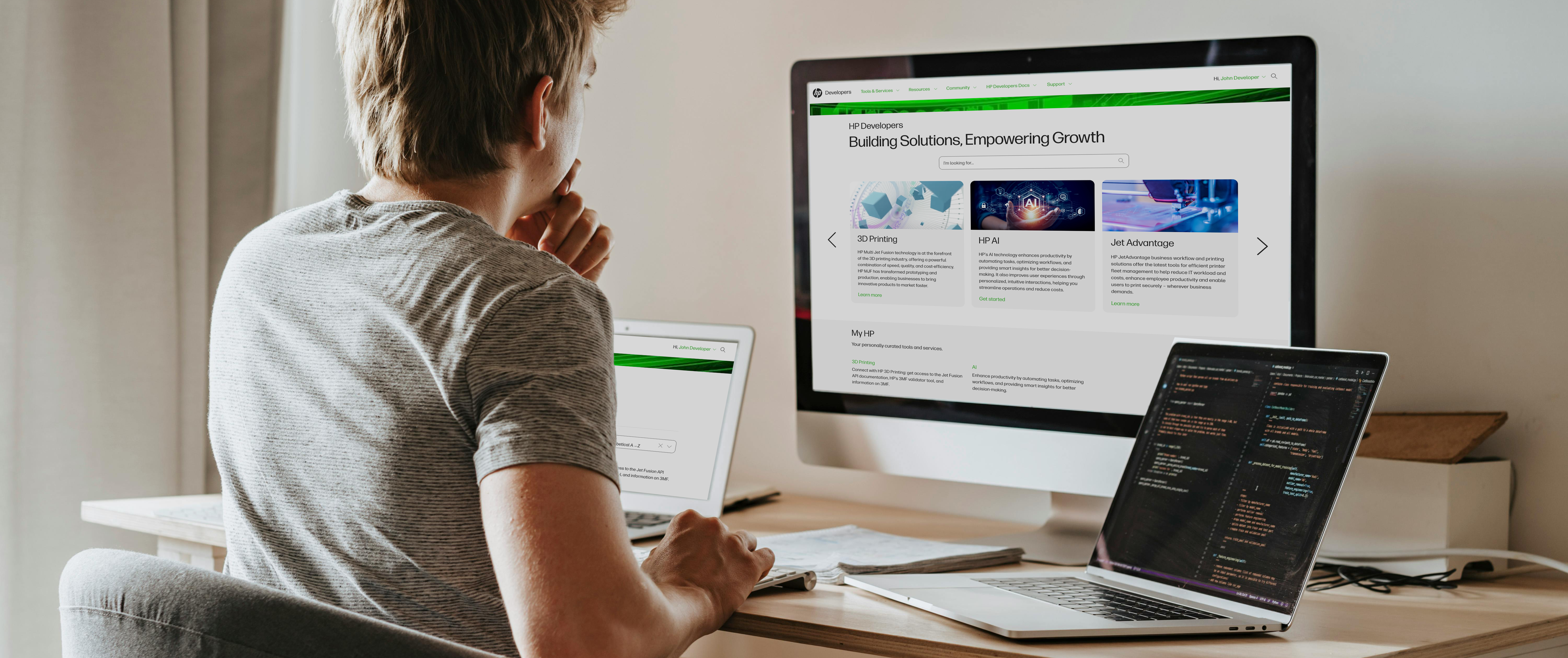
HP's Developer Portal
Make something real with HP Developer tools: the developer portal opened HP's garage and released APIs from some of HP's most innovative technologies to the dev community.
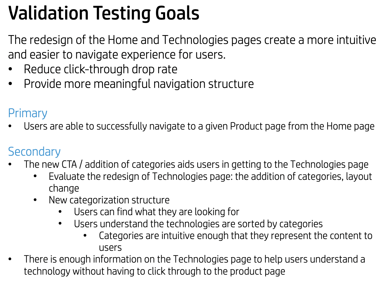
Goals
Following the initial launch of HP Developers, analytics revealed a behavior pattern in which visitors became trapped in a navigational loop between the homepage and the tools page, struggling to locate and access individual product pages. The goals of the redesign were to streamline product discovery and access for users and drive greater awareness and adoption of the portal across internal HP business groups.
Impact
- 74% decrease in user abadonment on the homepage
- Individual product pages all reported substantial increases in visitors
- Search functionality became the most used feature of the site
- Additional 15 HP products were onboarded to the portal
- Influenced stakeholders to invest more in the portal with API Credential Management
- Personal growth: deprioritizing attachment to a design based on user feedback leading to a more effective and user-centered solution
Role
As the Lead UX/UI Designer for HP’s Developer Portal, I was responsible for driving the end-to-end research and design process. This included conducting user research, facilitating ideation sessions, gathering feedback through testing, and developing low- to high-fidelity prototypes. I worked in close collaboration with the development team in Lean UX cycles to ensure alignment between design and implementation, and I also contributed front-end code changes within the Drupal environment to support the design vision.
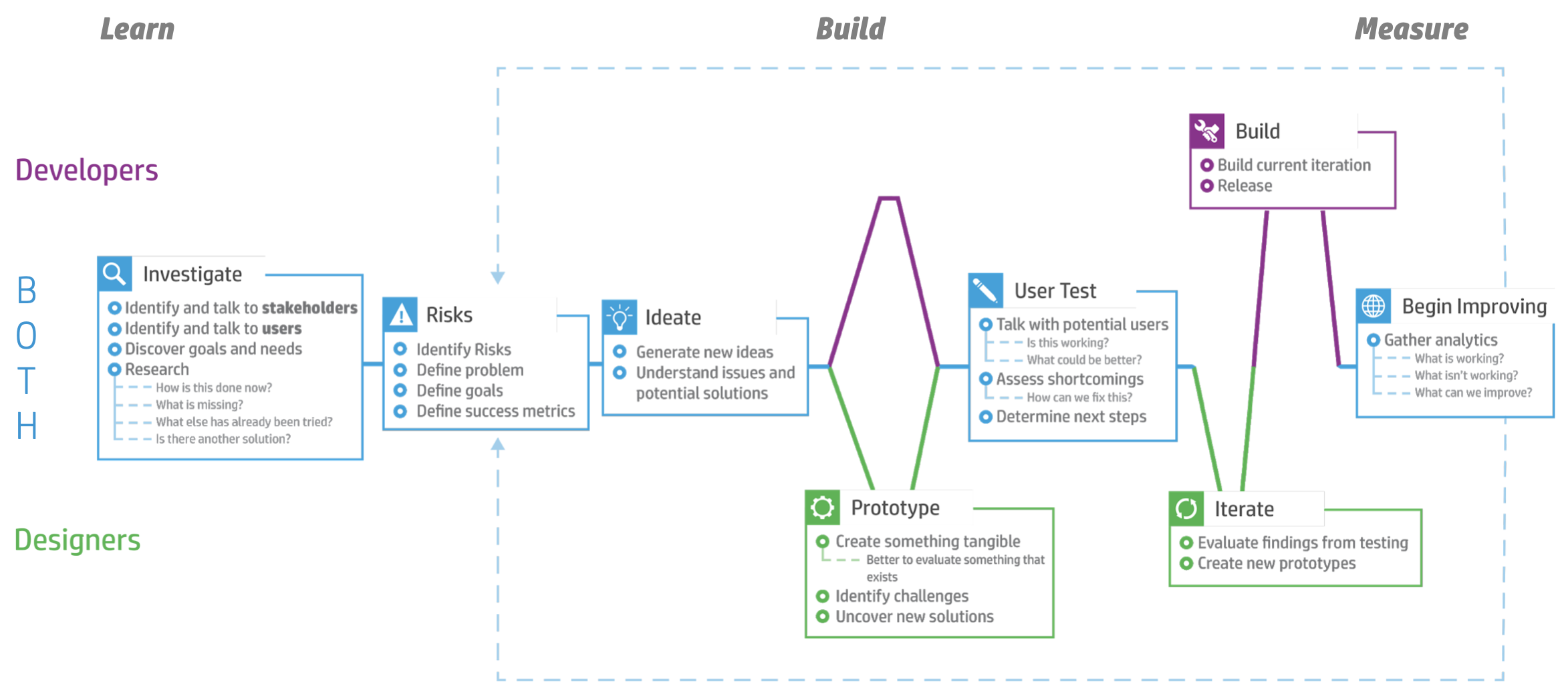
Lean UX cycle used for this project
Research
I initiated the redesign process with a thorough review of the portal’s two primary pages: the
home page and the tools list. This evaluation highlighted key pain points and opportunities for
improvement. To further inform our approach, I conducted a comprehensive benchmarking analysis
of leading developer portals from Microsoft, Google, Apple, and Amazon, in collaboration with a
developer, to assess user experience best practices and evolving user expectations.
The insights gathered were synthesized and shared with the team to guide strategic design
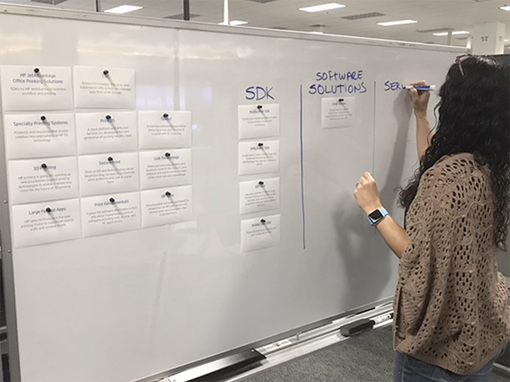
decisions. To better understand users’ mental models and content priorities, I facilitated a
card sorting exercise, the results of which directly influenced the creation of low-fidelity
wireframes outlining a revised site structure.
Using this data-driven foundation, I worked closely with the lead developer to explore and
iterate on multiple design solutions. Initial paper prototypes evolved through collaboration,
ensuring that all proposed designs were aligned with both user needs and the technical
constraints of the HP Developer Portal’s Drupal environment.
Home design review
Tools list design review
User research: cardsorting for information architecture
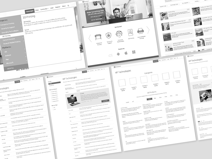
Digital sketches and wireframes
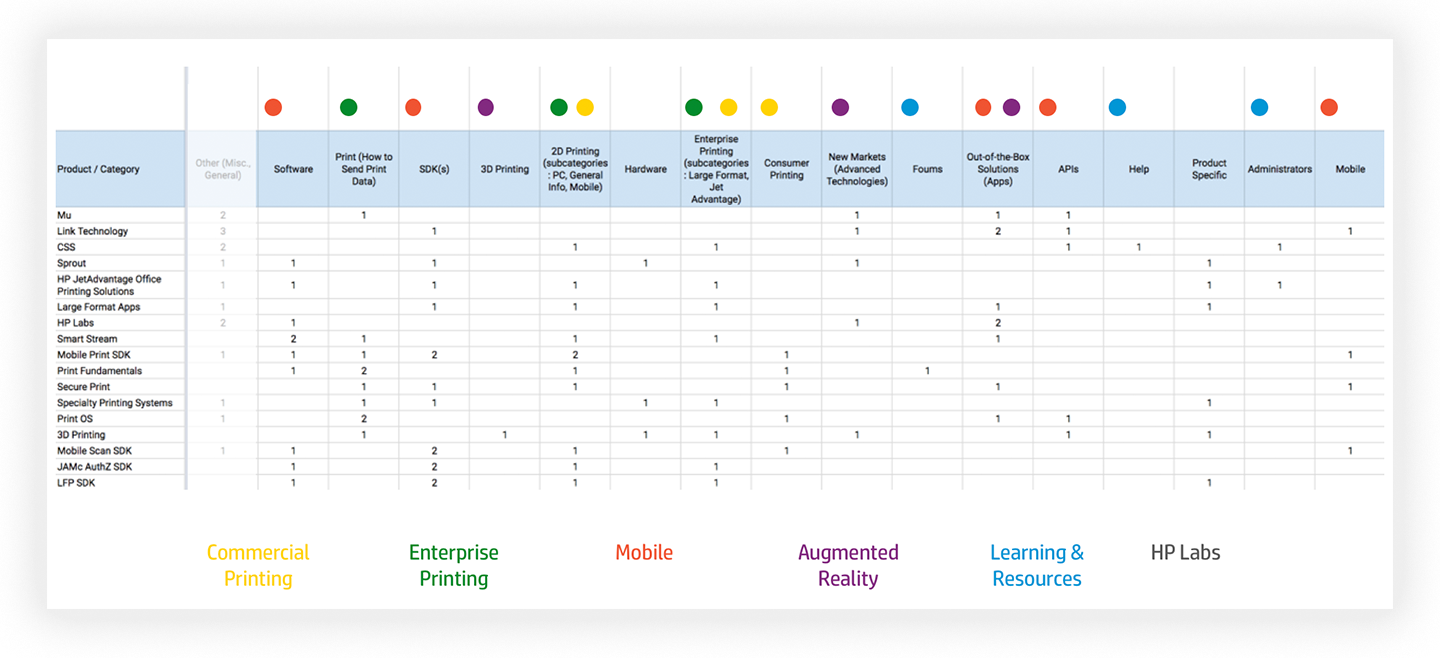
User research data compilation
Wireframe sketches and information architecture
Testing Round 1
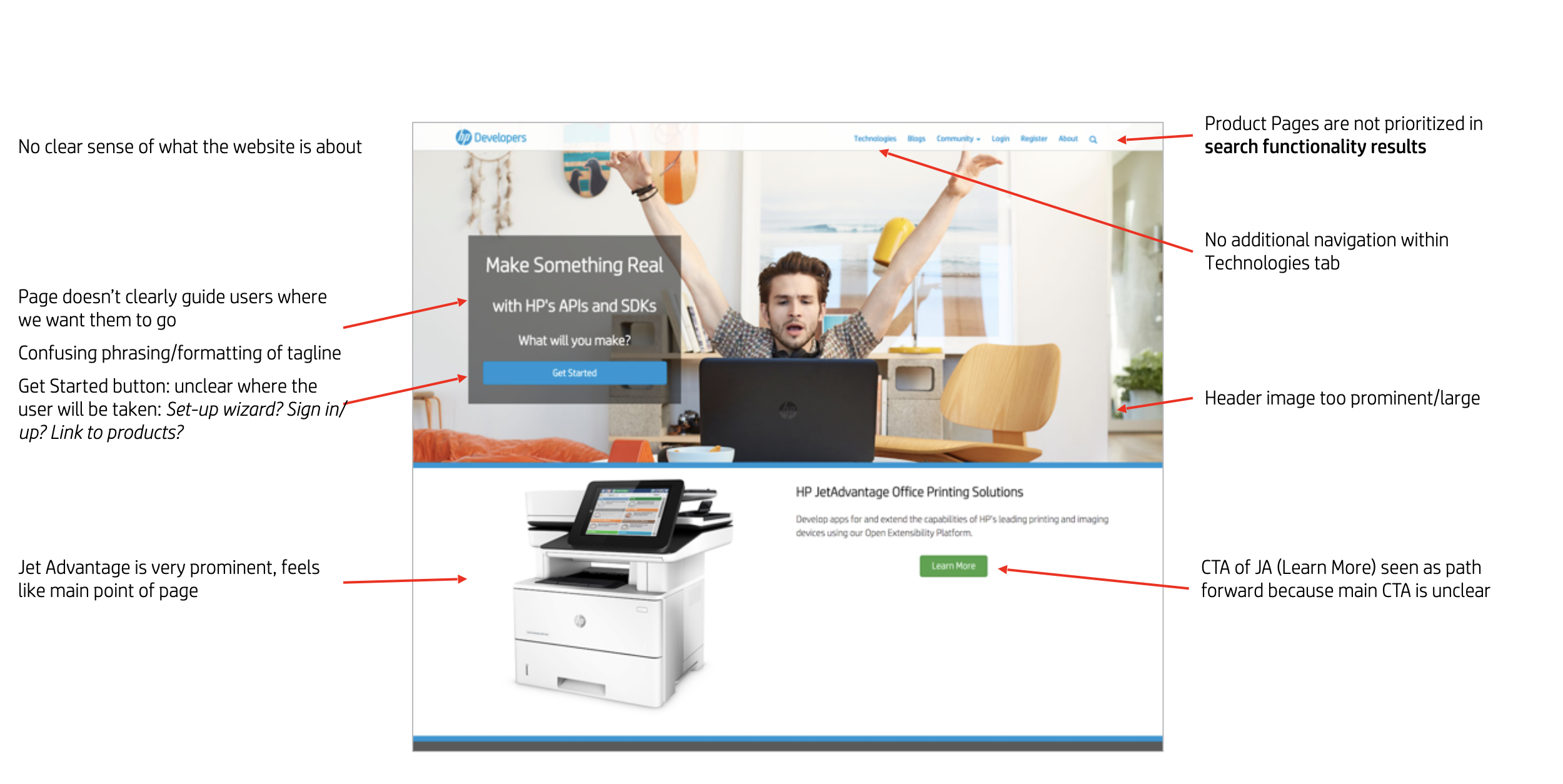
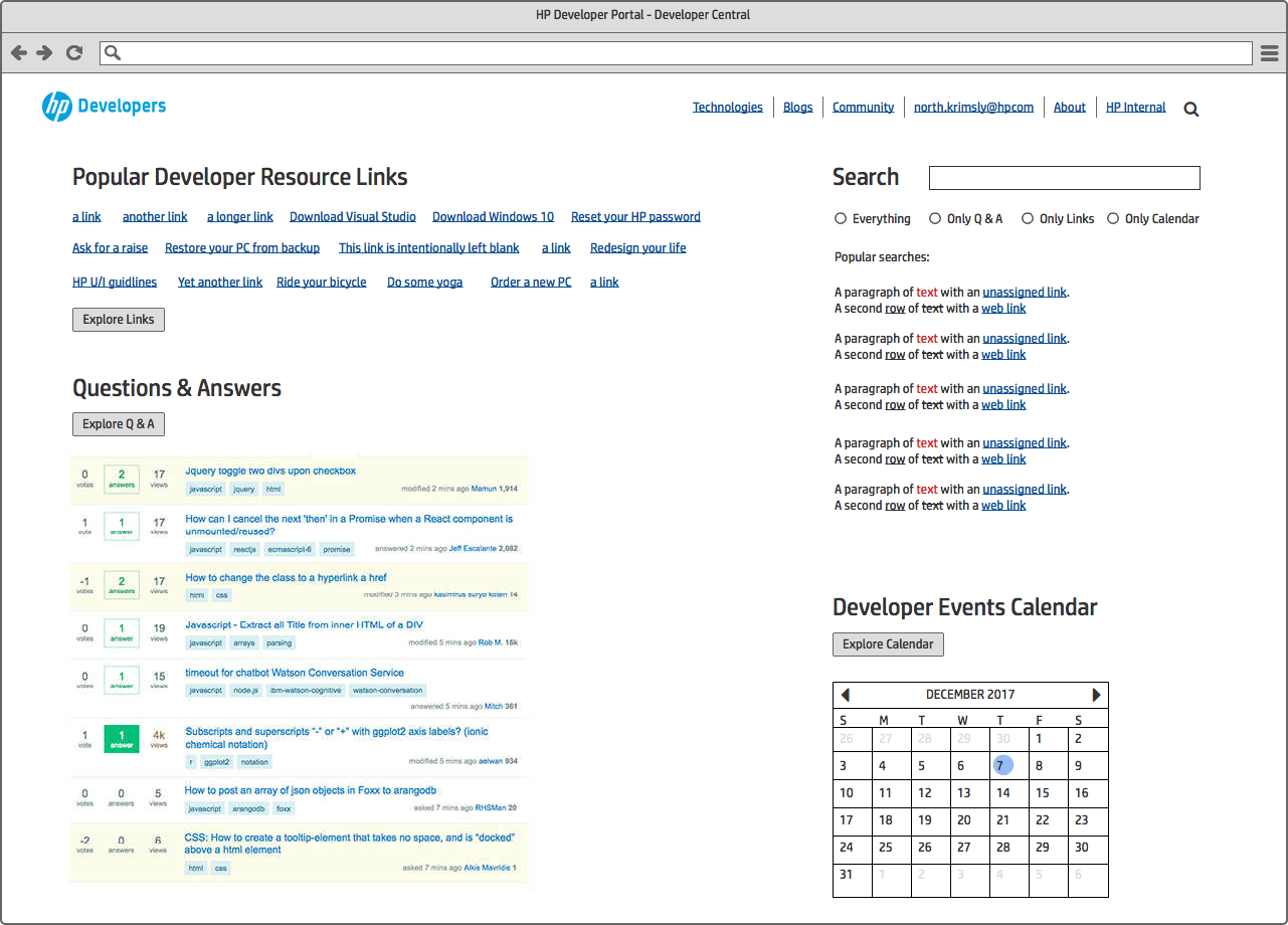
Low-fidelity prototypes were developed to conduct usability testing, with the initial plan to
engage ten users. However, after completing only three sessions, the remaining tests were
canceled due to consistently negative feedback. The prototypes failed to effectively address
user needs and, in some cases, introduced additional confusion within key task flows.
Participants found the experience overly complex, with too many elements competing for
attention.
Key feedback highlighted the need to elevate the visibility of the search functionality and
provide clearer indicators of the types of resources HP offers on the Home page. Additionally,
users expressed a strong preference for the ability to browse the full list of available
products on the Tools page, enabling a more comprehensive view of HP's offerings. While I was
disappointed about the failure of the design, these insights early in the process prompted a
critical reassessment of the design direction to better align with user expectations and improve
overall usability.
Initial redesign of the Home and Tools pages: "failed" design
Revision
Informed by feedback from both users and HP business stakeholders, I implemented substantial
revisions to enhance the overall design and usability (and fix the issues from the initial
redesign). Users expressed a strong preference for quickly locating specific solutions rather
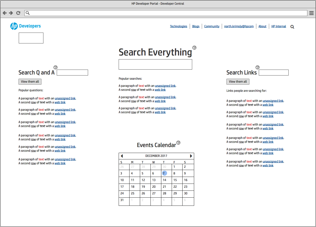
than browsing through a full list of resources. In response, the search functionality was
prominently repositioned at the top of the page to encourage search-driven navigation. To
further improve user engagement and content discoverability, a carousel was introduced to
feature new or highlighted resources, showcasing key offerings available to developers.
Additionally, a personalized section was added to display shortcuts to tools and services that
were either favorited or frequently accessed by the signed-in user. Beneath these primary
content areas, supplementary tools and links provided easy access to the broader Tools page for
more options.
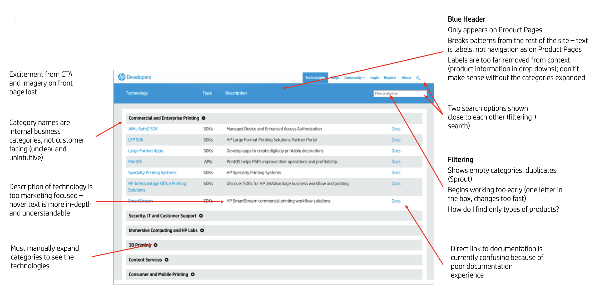
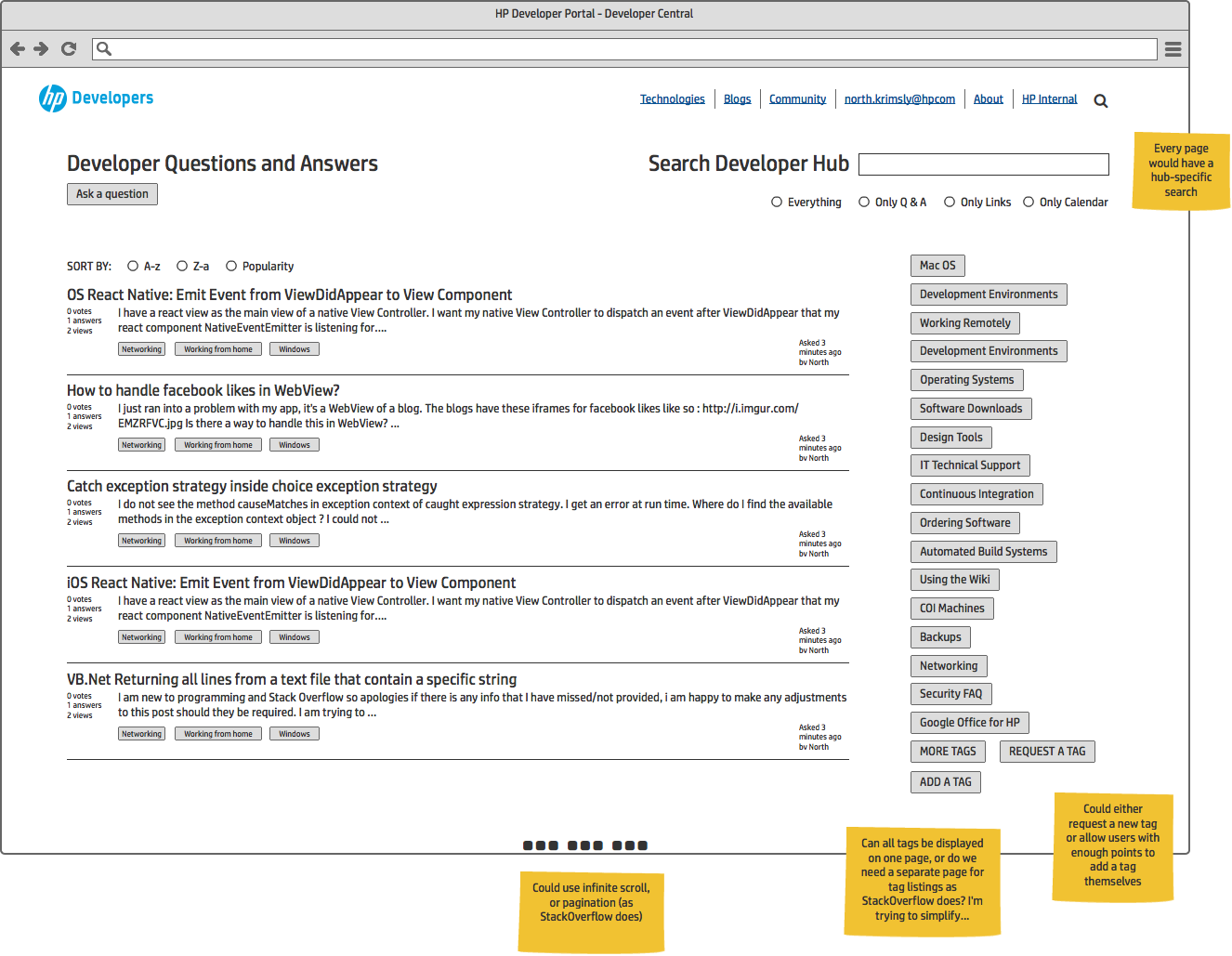
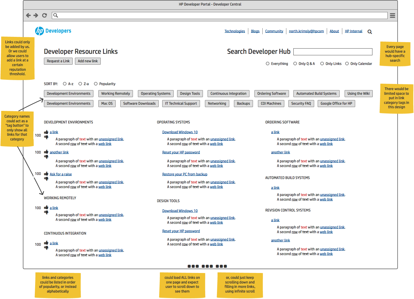
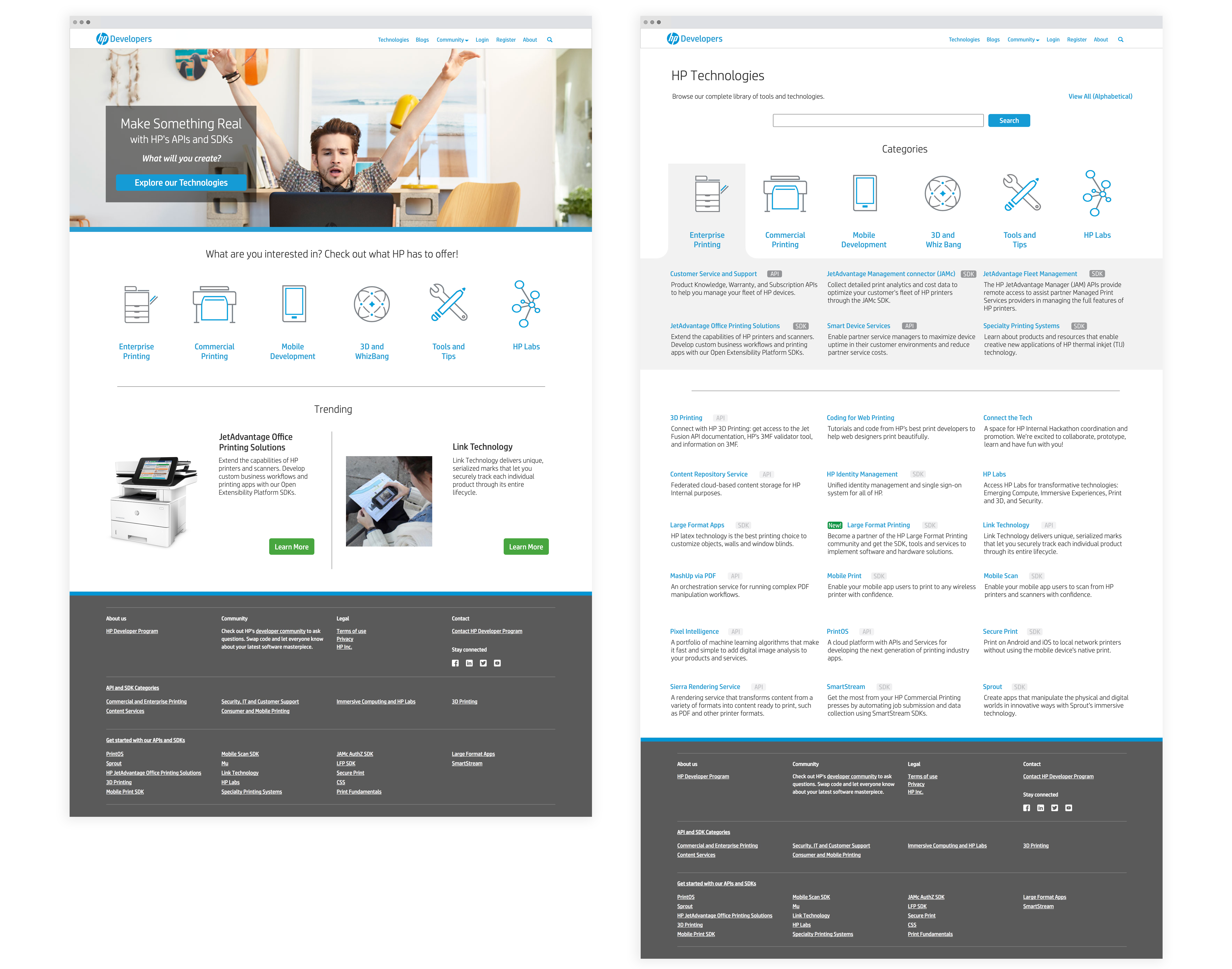
On the Tools page, each tool was presented with clear titles and concise
descriptions to align with developers’ natural scanning behaviors. To assist users who may be
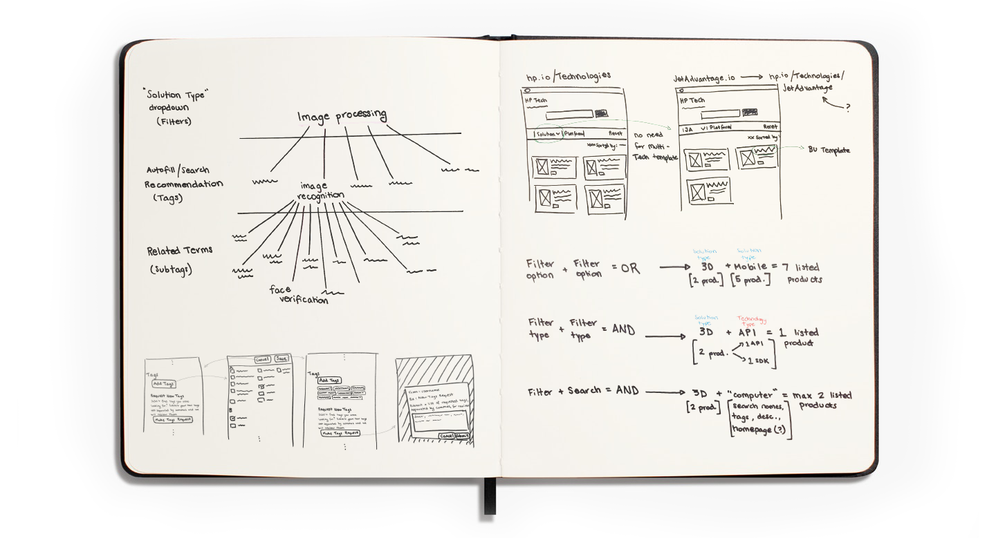
uncertain about which solution best meets their needs, straightforward filtering options were
introduced, allowing them to narrow down the available tools effectively. Additionally, the
search experience was redesigned to enhance visibility and usability. The improved interface
enables quicker filtering and greater discoverability, ultimately allowing users to identify
relevant resources more efficiently.
The same test plan was run on this improved
design to directly compare the results from the previous "failed" iteration and yeilded positive
results, encouraging us to proceed with implementation
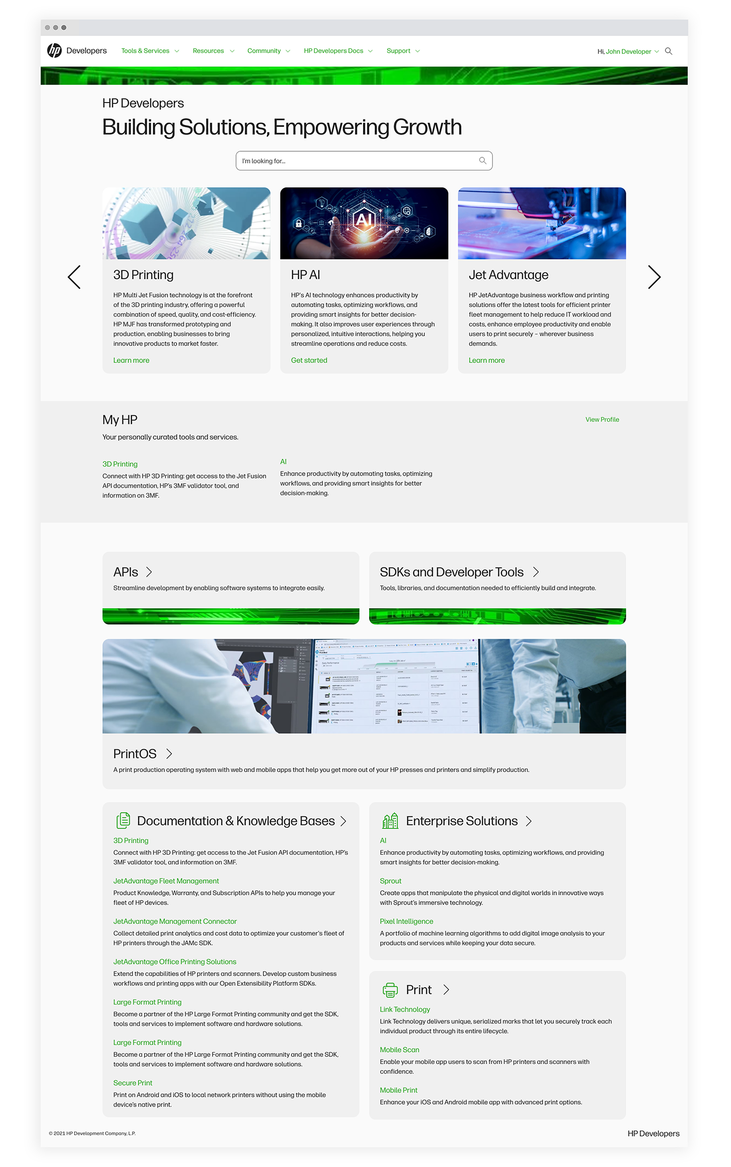
Re-redesigned Home page (scroll to see more)
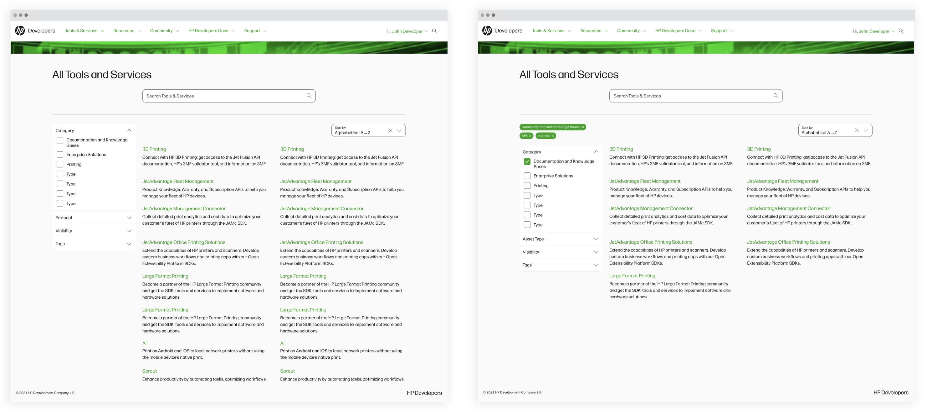
Re-redesigned Tools page with filtering
Results
As a result of the enhancements implemented on HP’s Developer Portal, site analytics revealed a 74% decrease in users experiencing the homepage-to-tools-page navigation loop. Engagement with individual product pages saw a substantial increase, and the search functionality became the most frequently used feature on the site. The improved visibility and usability of portal-hosted products also generated interest from additional internal teams, resulting in the onboarding of 15 new HP products within six months. The successful outcomes of the redesign prompted stakeholders to initiate the development of a new feature: API Credential Management.
API Credentials Request & Management
Although API Credentials Management is hosted on the external HP Developer Portal, it serves both internal and external developers as part of the broader developer experience. The portal allows developers to request and manage API product keys and secrets for code integration, while also providing API owners with tools to oversee and maintain the security of API requests.
Goals
Following the successful redesign of the external developer portal, the next phase focused on enhancing API workflows and the overall developer experience. The objective of the API credential request and management system was to streamline and secure access to HP APIs by establishing a unified workflow that enables both internal and external developers to easily request, manage, and monitor their API credentials.
Impact
- 25% reported decrease in time spent managing credentials
- 48% increase in API credentials requests
- 15 point increase in NPS score on hp.io
- Increased security for credential keys and secrets
- Improved integration of HP Developer portals
- Personal growth: communication across disciplines and interpreting technical needs into thoughtful design solutions
Process
The process of designing the API Credentials experience began with a deep dive
into user needs and security requirements, followed by close collaboration with a developer to
ensure usability, technical feasibility, and that it would be accomplishing user tasks. We also reviewed competitor key/secret experiences to understand flow and potential pain points. I started by mapping out typical user journeys including requesting new credentials, managing
existing keys, and revoking access to identify pain points and streamline interactions. I
created wireframes and low-fidelity sketches to visualize each step. This collaboration helped
ensure that the interface not only aligned with best practices for UX but also met developer
expectations for API management systems.
Throughout development, my developer and I maintained continuous communication to
refine the design based on real-time feedback and implementation insights. As the front-end
evolved, we tested the interface, focusing on clear messaging, error handling, and user guidance
to reduce confusion and minimize the risk of mistakes during sensitive actions like key
regeneration or revocation. Our teamwork enabled a balance between robust security features and
a clean, intuitive experience for developers. The end result was a user-friendly credential
management interface that met technical requirements without compromising usability.

Pre-design work with developer (scroll to see more)
Design Integration
A key challenge in the API Credentials work was ensuring seamless integration with the HP Developers internal page to avoid creating two disjointed or competing experiences. It was critical to design a smooth transition between the internal and external sites to minimize user friction and prevent disorientation during context switching. Based on feedback sessions, I recommended that links to hp.io open in a new window from hp.dev, enabling users to easily return to the internal site after completing their task or navigating away unintentionally. Additionally, I advocated for the implementation of the HPiD authentication system allowed users to manage their credentials without needing to log in again, maintaining a cohesive and efficient workflow.
Creating an API Product

Requesting API Credentials: flow from HP Developer Experience (internal developer site) to hp.io.
Users can initiate the credentials workflow from both the HP Developer Experience (internal developer portal) and the external-facing hp.io site. The internal portal provides a comprehensive catalog of HP-developed APIs available for internal use, including direct access to begin creating a product. On the external portal, developers can access APIs associated with specific technology groups (for example, APIs from HP's Link Technology program) via each group's dedicated page.
Within the credentials flow, developers can configure custom application forms, define attributes, assign Apigee proxies and resources, and manage team member access. Upon submission, the completed form is routed to the appropriate API administrator for approval.
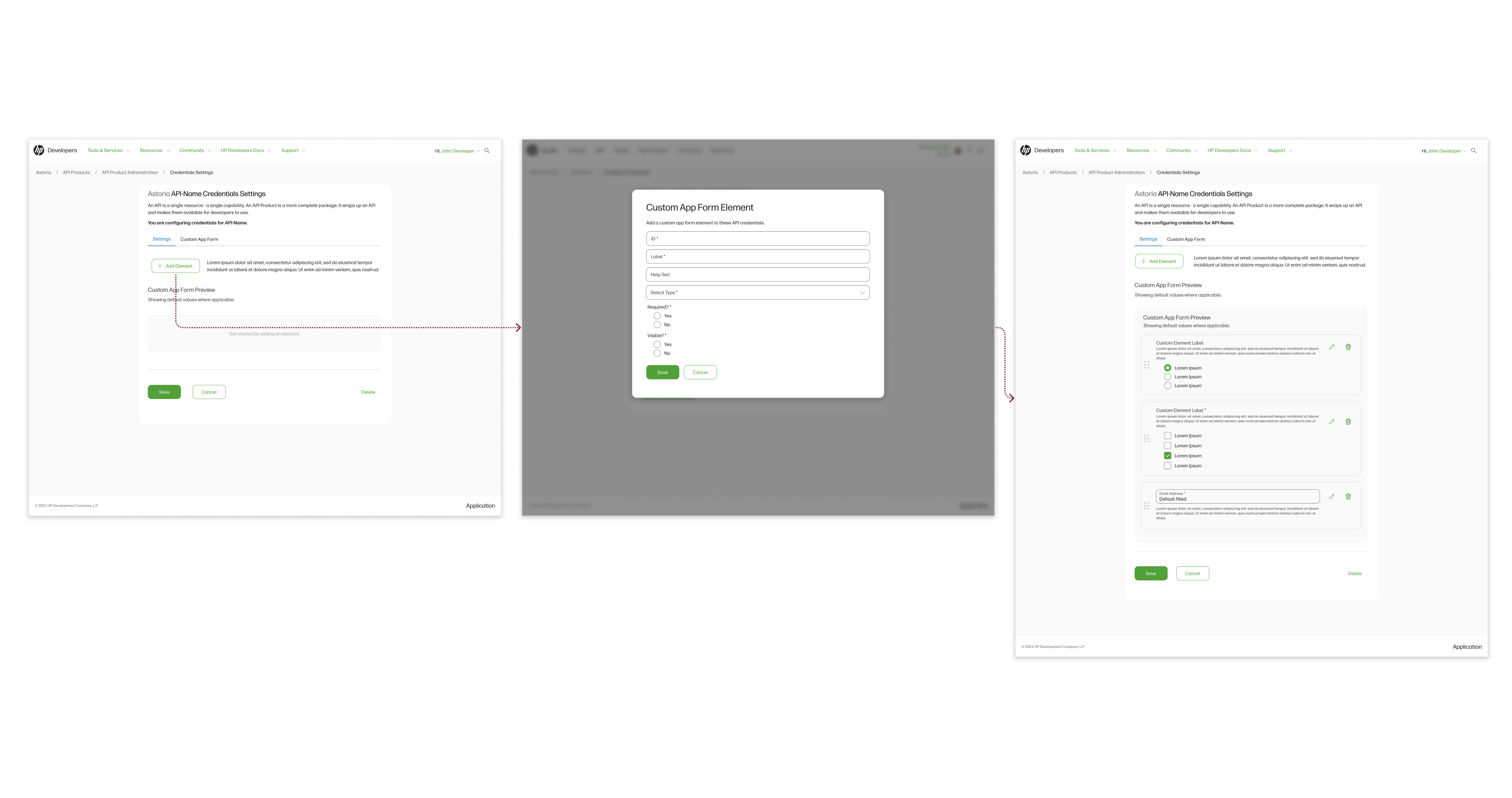
Setting a custom app form.

Adding Apigee proxies and resources.
Accessing My Credentials

Accessing my API keys and secrets: flow from HP Developer Experience (internal developer site, top) to hp.io.

Reveal secret then reset secret flow
After a request is made, the credential would be listed as a new item on the user's Credentials page. Both the internal and external developer portals leveraged the user's profile as the central access point for managing credentials, providing a consistent and intuitive experience. Users were presented with a consolidated view of their APIs, keys, and the status of any credential requests, allowing them to quickly assess key information at a glance without needing to drill into each credential. When users did choose to access a specific credential, they could view detailed configurations, make necessary edits, and reveal or reset their secrets. I iteratively refined this design through feedback sessions with developers to ensure clarity, completeness, and alignment with user expectations.
Managing Credentials & Requests
API administrating product credentials: flow from HP Developer Experience (top, internal developer site) and hp.io Tech Group (bottom) to hp.io.
To inform the design of the API Credentials Management system, I conducted interviews with several API owners and product administrators to understand their most and least frequent tasks. The most desired feature was the ability to apply actions to multiple credentials simultaneously. Given the complexity of each request, and after conducting a competitive analysis, I designed a data table interface that surfaced key details (such as Name, Owner, API, Date Created, Expiration Date, and Status) with advanced filtering and search capabilities for each field. This enabled administrators to isolate credentials by criteria such as owner (e.g., to revoke access from a compromised account), API type (e.g., to batch-approve related requests), or creation date (e.g., to manage issues tied to a specific time frame), streamlining bulk actions and improving response time.
Another common pain point was the ability to contact credential owners. Based on interview feedback, I placed email functionality at the table level, rather than within individual credentials, as administrators frequently needed to contact multiple users at once, typically within a specific time range or API group.
Additionally, administrators could drill down into individual credentials to view detailed information and perform the same actions available in the table. This view also displayed any custom application fields submitted by the user, which could be edited and reviewed before re-approval, ensuring both flexibility and control in managing credential lifecycle workflows.

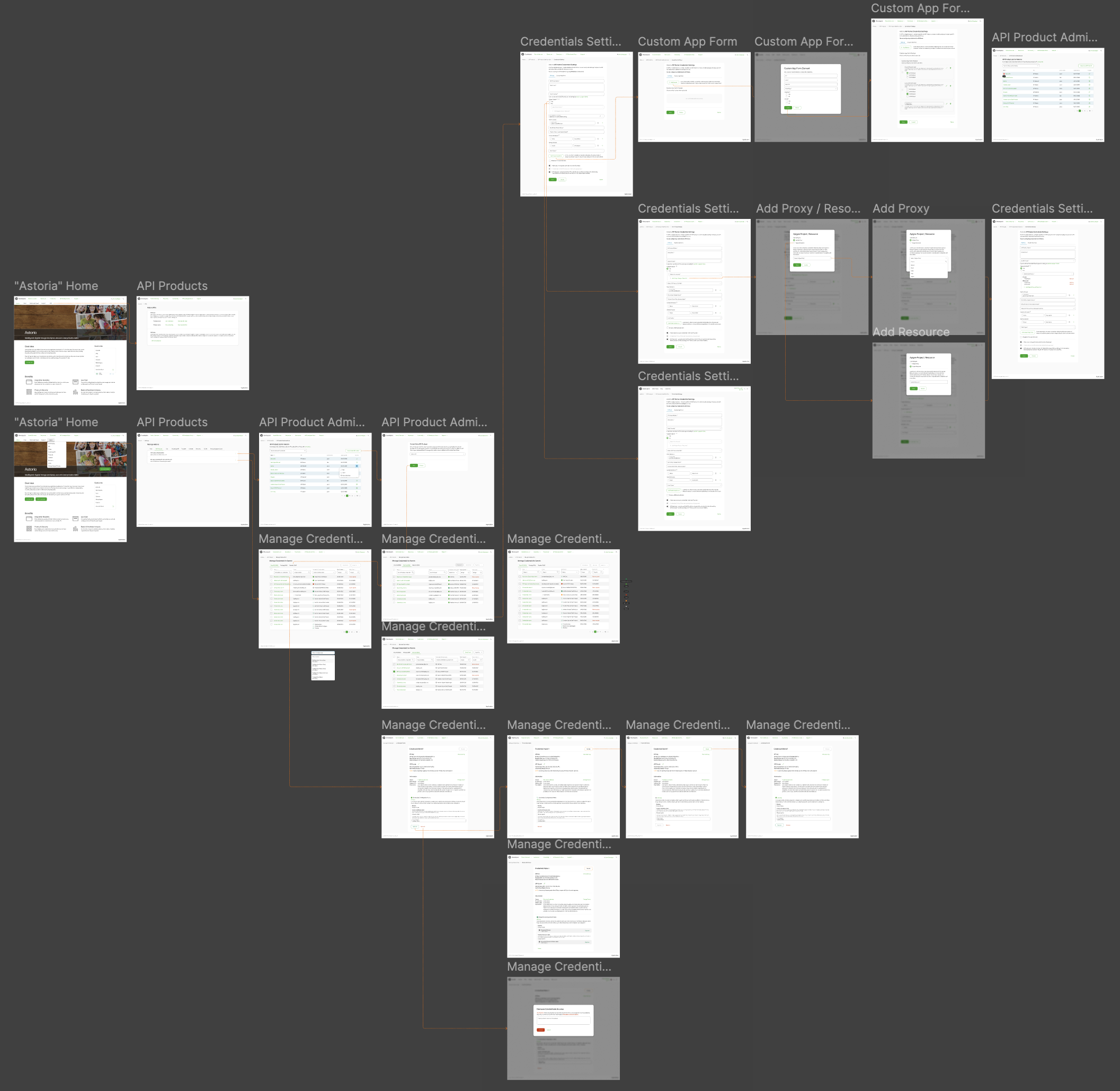
API Credentials: overall flows
Results and Impact
The system in the final design ensured that only authorized users could access API resources, supported security measures, and enabled API owners to review, approve, and manage access at scale. The result was a clear, centralized interface for credential lifecycle management to reduce friction for developers and improves oversight for administrators. After implementation, the Net Promotor score rose by 15 points, API requests increased by 48%, and API administrators reported decrease of 25% in time spent managing their API products.
On a more personal level, working on this aspect of the developer experience was especially meaningful to me as a designer. Designing for a technically complex domain where I didn’t have deep subject-matter expertise required a strong reliance on collaboration with developers and insights gained through user interviews. While I was able to define and enhance the user experience and interaction patterns, much of my understanding of the product itself came directly from the users. This project pushed me to grow in my ability to communicate across disciplines and interpret technical needs into thoughtful design solutions.